
CSS: An actual 3d bar chart
This article presents an experiment in creating a three dimensional bar chart that actually uses the 3D effects of perspective and rotation rather than just the skew transformation. The result is a chart that can be viewed from any direction.
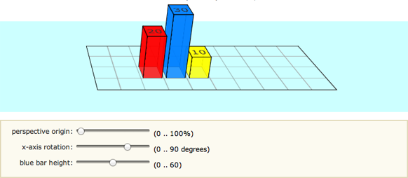
Working Demonstration
If you're using a WebKit browser (Safari, Chrome, iPhone, iPad) then you should see both a 3D bar chart as well as some sliders which can be used for modifying some aspects of the display.
In Firefox the bar chart has some artefacts (perhaps due to outline) and the sliders are rendered as plain input boxes, but still work. Other browsers don't yet support the 3D transformations.
N.B. most/all of the above issues will have been resolved in later browser versions.
The sliders (or input fields) will affect, in order:
- the left/right positioning of the perspective origin;
- the rotation of the chart into the page; and
- the height of the centre (blue) column.
The view controller is the only part of this demonstration that requires JavaScript to implement. Enjoy.
A screen capture of the initial position for anyone using a non-supported browser:
Setting up the grid
As in other examples, we first set up a #stage element in which we can define the perspective at which any 3D tranformations will be viewed - basically where the viewer is in relation to the flat screen. Then, because we're creating a graph, we need to set up the axes and a grid (#chart).
While we could have easily created a background image and tile it to form a grid pattern, we decided instead to make use of the CSS linear gradients syntax. In all the code below the -moz- styles simply duplicate the -webkit- styles.
<style>

  #stage {
    -webkit-perspective: 1200px;
    -webkit-perspective-origin: 0% 0%;
    -moz-perspective: 1200px;
    -moz-perspective-origin: 0% 0%;
    perspective: 1200px;
    perspective-origin: 0% 0%;
    background: rgba(0,255,255,0.2);
  }

  #chart {
    position: relative;
    margin: 1em auto;
    width: 400px;
    height: 160px;
    border: 1px solid #000;
    background: -webkit-repeating-linear-gradient(left, rgba(0,0,0,0) 0, rgba(0,0,0,0) 38px, #ccc 40px), -webkit-repeating-linear-gradient(bottom, rgba(0,0,0,0), rgba(0,0,0,0) 38px, #ccc 40px);
    background: -moz-repeating-linear-gradient(left, rgba(0,0,0,0) 0, rgba(0,0,0,0) 38px, #ccc 40px), -moz-repeating-linear-gradient(bottom, rgba(0,0,0,0), rgba(0,0,0,0) 38px, #ccc 40px);
    background: repeating-linear-gradient(left, rgba(0,0,0,0) 0, rgba(0,0,0,0) 38px, #ccc 40px), repeating-linear-gradient(bottom, rgba(0,0,0,0), rgba(0,0,0,0) 38px, #ccc 40px);
    -webkit-transform-origin: 50% 50%;
    -webkit-transform: rotateX(65deg);
    -webkit-transform-style: preserve-3d;
    -moz-transform-origin: 50% 50%;
    -moz-transform: rotateX(65deg);
    -moz-transform-style: preserve-3d;
    transform-origin: 50% 50%;
    transform: rotateX(65deg);
    transform-style: preserve-3d;
  }

</style>
The chart size is 400 x 160 pixels with a grid of 40 pixels. As you can see the background grid is made up of two repeating gradients running horizontally and vertically. The chart has been tilted away from the screen by 65 degrees.
Defining a bar in 3D
Each bar in/on the chart is made up of four sides and a cap. The styles here are for a generic bar CSS class which can then be used multiple times in different positions and colours. They are defined in the HTML as you will see shortly.
To picture the transformations that are being applied think of a vertical cross flat on the page. The four sides are then rotated away from us to form a column. Simple.
<style>

  .bar {
    position: absolute;
    bottom: 40px;
    margin: 0 4px;
    width: 32px;
    height: 40px;
    outline: 1px solid #000;
    text-align: center;
    line-height: 40px;
    -webkit-transform-style: preserve-3d;
    -moz-transform-style: preserve-3d;
    transform-style: preserve-3d;
    font-size: 20px;
  }
  .barfront,
  .barback,
  .barleft,
  .barright {
    position: absolute;
    outline: inherit;
    background: inherit;
  }
  .barfront {
    width: inherit;
    bottom: 0;
    -webkit-transform: rotateX(90deg);
    -webkit-transform-origin: 50% 100%;
    -moz-transform: rotateX(90deg);
    -moz-transform-origin: 50% 100%;
    transform: rotateX(90deg);
    transform-origin: 50% 100%;
  }
  .barback {
    width: inherit;
    top: 0;
    -webkit-transform: rotateX(-90deg);
    -webkit-transform-origin: 50% 0;
    -moz-transform: rotateX(-90deg);
    -moz-transform-origin: 50% 0;
    transform: rotateX(-90deg);
    transform-origin: 50% 0;
  }
  .barright {
    height: inherit;
    right: 0;
    -webkit-transform: rotateY(-90deg);
    -webkit-transform-origin: 100% 50%;
    -moz-transform: rotateY(-90deg);
    -moz-transform-origin: 100% 50%;
    transform: rotateY(-90deg);
    transform-origin: 100% 50%;
  }
  .barleft {
    height: inherit;
    left: 0;
    -webkit-transform: rotateY(90deg);
    -webkit-transform-origin: 0% 50%;
    -moz-transform: rotateY(90deg);
    -moz-transform-origin: 0% 50%;
    transform: rotateY(90deg);
    transform-origin: 0% 50%;
  }

</style>
In the CSS code we haven't defined the position of the bar in the chart or it's colour. That needs to be done separately for each element. Note however that we've used the inherit property where possible to make this simple.
Bar chart HTML markup
Here you can see the code in practice as used for the demonstration below. There are three bars placed on the chart. Each bar is a div, with four child divs making up the four sides. You can have any number of bars and place them anywhere on the chart.
<div id="stage">
  <div id="chart">
    <div class="bar" style="left: 80px; background: rgba(255,0,0,0.8); transform: translateZ(80px);">
      <div class="barfront" style="height: 80px;"></div>
      <div class="barback" style="height: 80px;"></div>
      <div class="barright" style="width: 80px;"></div>
      <div class="barleft" style="width: 80px;"></div>
      20
    </div>
    <div class="bar" style="left: 120px; background: rgba(0,127,255,0.8); transform: translateZ(120px);">
      <div class="barfront" style="height: 120px;"></div>
      <div class="barback" style="height: 120px;"></div>
      <div class="barright" style="width: 120px;"></div>
      <div class="barleft" style="width: 120px;"></div>
      30
    </div>
    <div class="bar" style="left: 160px; background: rgba(255,255,0,0.8); transform: translateZ(40px);">
      <div class="barfront" style="height: 40px;"></div>
      <div class="barback" style="height: 40px;"></div>
      <div class="barright" style="width: 40px;"></div>
      <div class="barleft" style="width: 40px;"></div>
      10
    </div>
  </div>
</div>
In the code above you can see highlighted the code that sets the x-position of the bar in the chart as well as the height of each bar (which needs to be defined for each element making up the bar). In there as well are the colours (red, blue, yellow) to which we've applied a slight transparency.
Controller JavaScript Source Code
For the curious, here is the JavaScript behind the graph control panel. It takes the changing values of each slider and applies them as CSS values to the relevant DOM elements:
<script>

  const changePerspective = (e) => {
    let el = e.target;
    let target = document.getElementById(el.dataset.for);
    target.style["WebkitPerspectiveOrigin"] = parseInt(el.value) + "% 0%";
    target.style["MozPerspectiveOrigin"] = parseInt(el.value) + "% 0%";
    target.style["perspective-origin"] = parseInt(el.value) + "% 0%";
  };

  const changeRotation = (e) => {
    let el = e.target;
    let target = document.getElementById(el.dataset.for);
    target.style["WebkitTransform"] = "rotateX(" + parseInt(el.value) + "deg)";
    target.style["MozTransform"] = "rotateX(" + parseInt(el.value) + "deg)";
    target.style.transform = "rotateX(" + parseInt(el.value) + "deg)";
  };

  const changeBarHeight = (e) => {
    let el = e.target;
    let target = document.getElementById(el.dataset.for);
    target.style["WebkitTransform"] = "translateZ(" + parseInt(4 * el.value) + "px)";
    target.style["MozTransform"] = "translateZ(" + parseInt(4 * el.value) + "px)";
    target.style.transform = "translateZ(" + parseInt(4 * el.value) + "px)";
    let arr = target.getElementsByTagName("div");
    arr[0].style.height = arr[1].style.height = arr[2].style.width = arr[3].style.width = parseInt(4 * el.value) + "px";
    arr[4].innerHTML = parseInt(el.value);
  };

  document.querySelector("#control_perspective").addEventListener("input", changePerspective);
  document.querySelector("#control_rotation").addEventListener("input", changeRotation);
  document.querySelector("#control_bar_height").addEventListener("input", changeBarHeight);

</script>
In most cases you can now do away with the prefixed CSS values (highlighted throughout the above code) as all modern browsers should support these attributes.
If you have any questions or comments or make use of this in one of your own projects please let us know using the Feedback form below.
Related Articles - Transforms and Transitions
- CSS Animation Using CSS Transforms
- CSS Transition Timing Functions
- CSS Bouncing Ball Animation
- CSS Animated Background Gradients
- CSS Upgraded fading slideshow
- CSS Infinite Animated Photo Wheel
- CSS 3D Transforms and Animations
- CSS An actual 3D bar chart
- CSS Photo Rotator with 3D Effects
- JavaScript Animating objects over a curved path
- JavaScript CSS Animated Fireworks
- CSS Fading slideshow with a touch of JavaScript
- JavaScript Controlling CSS Animations
David Aldridge 11 October, 2016
Fix for artifacts in FireFox (comes from outline - change it to border):
.bar {position: absolute;
bottom: 40px;
margin: 0 4px;
width: 32px;
height: 40px;
/* outline: 1px solid #000; */
border-style: solid;
border-width: 1px;
text-align: center;
line-height: 40px;
-webkit-transform-style: preserve-3d;
-moz-transform-style: preserve-3d;
-ms-transform-style: preserve-3d;
font-size: 18px;
}
.barfront, .barback, .barleft, .barright {
position: absolute;
/* outline: inherit; */
border-style: inherit;
border-width: inherit;
background: inherit;
}
Kishor 17 August, 2016
This is very good example of 3D chart. Can you please provide the javascript code so that it will be easy to understand the chart with its input fields
The Javascript code is in the HTML for the sliders:
x-axis rotation: <input type="range" size="3" max="90" value="65" onchange="this.value = parseInt(this.value);
document.getElementById('chart').style['WebkitTransform'] = 'rotateX(' + this.value + 'deg)';
document.getElementById('chart').style['MozTransform'] = 'rotateX(' + this.value + 'deg)';
"> (0 .. 90 degrees)