
CSS: border-radius and -moz-border-radius
One of the most keenly-anticipated CSS3 properties is border-radius. Web designers will no longer have to resort to complex table structures using custom-made corner graphics or including arcane JavaScript files in order to produce designs with rounded corners.
While Internet Explorer before IE9 doesn't support many (or any) advanced CSS properties, the Mozilla (Firefox and related browsers) and WebKit (Apple's web browser engine used in Safari and Chrome) and Opera have supported them for many years.
The vendor prefixes (-moz, -webkit) are now no longer necessary for the latest browser releases as they have all adopted the official CSS3 syntax.
Definition and syntax for border-radius
As with many CSS properties relating to margins, padding and borders, there are four individual properties - one for each corner of a box element - and one shorthand property. Each of the corner attributes will accept either one or two values. The border-radius property will accept up to two values in WebKit browsers and up to eight now in Firefox 3.5.
Here are the CSS and browser-specific attributes in question:
| CSS3 | Mozilla equivalent | WebKit equivalent |
|---|---|---|
| border-top-right-radius | -moz-border-radius-topright | -webkit-border-top-right-radius |
| border-bottom-right-radius | -moz-border-radius-bottomright | -webkit-border-bottom-right-radius |
| border-bottom-left-radius | -moz-border-radius-bottomleft | -webkit-border-bottom-left-radius |
| border-top-left-radius | -moz-border-radius-topleft | -webkit-border-top-left-radius |
| border-radius | -moz-border-radius | -webkit-border-radius |
Prior to IE9 these CSS3 properties do not work in Internet Explorer. The 'Mozilla' versions however work perfectly well in Firefox and other Mozilla-based browsers and the 'WebKit' ones in Safari and Chrome as well as the iPhone/iPad.
Each of the individual corner CSS3 properties take either one or two length values (generally 'px' or 'em' values). If a single value is supplied then that becomes the radius of a rounded corner. If two values are supplied then they become the horizontal and vertical radii for an elliptical corner.
The Mozilla syntax before Firefox 3.5 only supported round (as opposed to elliptical) corners and adding a second value would result in a standard square corner.
The border-radius property in WebKit accepts one or two values and uses them to style all four corners making a nice symmetric shape. The new Firefox syntax allows you to define four different round or elliptical corners. A slash has been introduced to separate the horizontal and vertical length settings.
There is no pure-CSS solution for rounded corners in IE8 or other primitive browsers. Only a range of JavaScript patches which can be found by searching online.
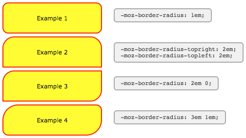
Using -moz-border-radius in Mozilla (Firefox)
The following examples will only work if you're using Firefox or another Mozilla browser that supports -moz-border-radius properties.
-moz-border-radius: 1em;
-moz-border-radius-topright: 2em;
-moz-border-radius-topleft: 2em;
-moz-border-radius: 2em 0;
-moz-border-radius: 3em 1em;
The Mozilla properties used here do not conform to the standard (hence the -moz- prefix) and until Firefox 3.5 only supported round corners. In newer versions of Firefox elliptical corners are also possible.
As some people have pointed out these properties can be used not just for 'boxes' but for many other HTML objects including form elements.
For those of you still seeing square corners, here's a snapshot from Firefox showing the rounded corners effect:
There are a number of tricky JavaScript solutions that allow border-radius and other CSS3 properties to be seen in Internet Explorer and other browsers - but the overheads don't really justify the results.
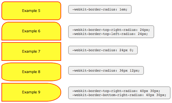
Using -webkit-border-radius in Safari (Webkit)
The latest versions of Safari now support -webkit-border-radius. Previously only the 'nightly builds' contained this functionality In Opera the syntax for the corners is the same as in Safari, but the behaviour of border-radius with two values matches that of Firefox, as seen in Example #7 below:
-webkit-border-radius: 1em;
-webkit-border-top-right-radius: 24px;
-webkit-border-top-left-radius: 24px;
-webkit-border-radius: 24px 0;
-webkit-border-radius: 36px 12px;
-webkit-border-top-right-radius: 50px 30px;
-webkit-border-bottom-right-radius: 50px 30px;
For those of you still seeing square corners, below you can find asnapshot from WebKit showing the rounded corners effect. Note particularly the change in syntax and the effect of passing two values to -webkit-border-radius as compared to the -moz-border-radius example above.
WebKit also has limited support for other CSS3 border properties such as: multiple backgrounds; border background images; and various advanced selectors (::select for example) making it a great test platform for forward-looking developers. Stay tuned to the Surfin' Safari blog linked below for the latest exciting developments.
Other special effects
WebKit, Firefox and Opera now support a number of other CSS3 features, including the following simple effects and transforms. Thankfully, unlike rounded corners, for the shadows and transforms there does seem to be agreement on a common syntax.
-webkit-box-shadow
-webkit-border-radius: 36px 12px;
-moz-border-radius: 36px / 12px;
border-radius: 36px / 12px;
box-shadow: 2px 2px 6px rgba(0,0,0,0.6);
Clearly there are still some anti-aliasing problems, but for corners and gentle curves it can look pretty cool.
Then there are various -webkit-transform option that can be used to create all kinds of wierd and wonderful shapes:
-webkit-transform: rotate()
-webkit-border-radius: 36px 12px;
-moz-border-radius: 36px / 12px;
border-radius: 36px / 12px;
-webkit-transform: rotate(-5deg);
-webkit-transform: skew()
-webkit-border-radius: 36px 12px;
-moz-border-radius: 36px / 12px;
border-radius: 36px / 12px;
-webkit-transform: skew(5deg,5deg);
For the browser-impaired here is a screenshot from Safari showing the effect of these CSS rules. The same effects are now possible in Firefox, Opera and related browsers. Just replace -webkit with -moz or -o, except for border-radius and box-shadow where Opera uses no prefix.
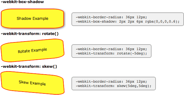
Also in Safari these and other transformations can be implemented as animations using just CSS effects triggered by hovering over an element - no JavaScript required.
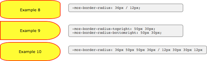
New short-hand properties
The following syntax is now working in Firefox and Opera allowing you to specify not only matching elliptical corners, but also different elliptical corners in one shorthand property.
Here we've recreated two of the WebKit examples above using the new syntax. You can see that the individual corner settings work exactly the same now in Firefox as in WebKit, but for the short-hand property you need to include a slash:
border-radius: 36px / 12px;
border-radius-topright: 50px 30px;
border-radius-bottomright: 50px 30px;
And now to the scary part. Using the short-hand property, all values before the slash apply to the horizontal radii and all values afterwards to the vertical. In this example we've created a hybrid of the previous two examples.
border-radius: 36px 50px 50px 36px / 12px 30px 30px 12px
Here you can see what these boxes look like in Firefox 3.5:
With all major browsers now using the same syntax, the vendor-prefixes have been dropped and the standard seems to be set in stone.
List with rounded corners
Here's a nice example of an unordered list (UL) marked up using CSS to apply a border radius to just the outer corners of the first and last elements:
- rounded
- corners
- first & last
- elements
The CSS markup is as follows:
<style>

  ul.rounded {
    margin: 0;
    padding: 0;
    width: 200px;
    background: #ababab;
    border-radius: 1em;
    box-shadow: 2px 2px 4px #666;
  }
  ul.rounded li {
    display: block;
    margin: 0 0 1px;
    padding: 4px 12px;
    background: #dedede;
    transition: 0.2s;
  }
  ul.rounded li:first-child {
    border-radius: 1em 1em 0 0;
  }
  ul.rounded li:last-child {
    border-radius: 0 0 1em 1em;
  }
  ul.rounded li:hover {
    padding-left: 20px;
    background: #efefef;
  }

</style>
The HTML markup is for a standard UL list element with class="rounded".
By making use of the first-child and last-child selectors we avoid having to identify which elements to apply the border radius to in our HTML.
References
- W3C: CSS3 module: Border
- W3C: CSS Backgrounds and Borders Module Level 3
- Surfin' Safari
- The CSS3 border-radius property
User Comments
Most recent 20 of 38 comments:
Post your comment or question
nunyabidness 8 September, 2014
First use of example 8 does not match the code alongside it.
Not now, but it used to (in WebKit). The new equivalent syntax is border-radius: 36px / 12px; instead of border-radius: 36px 12px;.
Ian Favell 27 July, 2013
1) In Opera the border-radius works when the property is applied directly to the image, whether using in-line CSS, internal CSS (between head tags) or with external CSS. 2) The border-radius is also correctly rendered for CSS-generated images, such as on my website's tabbed navigation menu and the backgrounds to the numbers in the website's pagination menu. When, however, the property is applied to a DIV it DOES NOT work correctly, as can be seen in the image gallery of the website I created for my web-design tutorial; in Opera , the border-radius on the gallery images works in part, presumably for the div to which it is applied, whilst the square corners of the image remain in place, much as you would see in the other browsers if the 'overflow:hidden' were not being used.
Working with Firefox, Chrome and Opera, I tried to give Opera a different border-radius value to the other browsers such that it would display proper square corners whilst leaving Firefox and Chrome with rounded corners. Using the -webkit- and -moz- prefixes for Chrome and Firefox respectively I was partially successful: I got the square corners for Opera, the rounded corners for Chrome, but lost the rounded corners in Firefox; evidently, Firefox no longer recognizes the -moz- prefix (according to someone on the web this stopped working for him with Firefox 13.0). The in-line CSS solution would deprive one of significant control when applying the border-radius to a large group of images.
Do you know if a solution exists for this circumstance without resorting to something like javascript (I tried the jquery corners option, but this did not work as it assumes Opera supports the native CSS border-radius)?
cheryl 7 July, 2013
I got it to work on IE9 - pasted the code in this article - wasnt working. Then on another website I found out that if will not work if you do not have correct meta in your head tags:
<meta http-equiv="X-UA-Compatible" content="IE=9" />
Applied it and it worked!
A valid DOCTYPE at the top of the page may have the same effect.
Sepatu Futsal 21 May, 2013
Thanks for this nice tutorial. I have just know that we can rotate the element with css. Keep posting. But I have problems with IE8 border radius. It doesn't work. How can I fix it?
NYinker 3 April, 2012
Nicely done
If images is all I need I go for GD library, go and check out demo at labs.greeni.pl/mini/
Stanley 27 February, 2012
alfin lo que buscaba.. gracias de verdad. esperemos que los de aqui a un tiempo todos los navegadores ya esten incluyendo el CSS3. pues la verdad que es molesto tener que tomar en cuento eso mas.... saludos a todos......
Marcel 20 February, 2012
@sonu
border-radius works fine in IE9, been using it massively on www.appwereld.nl
IE7,6, etc aren't things I'd be concerned about lol. Only issue might be it's not working in IE8
Subhash Patidar 9 November, 2011
Hi Dear,
I liked your script but it is not working in IE version
so please if u have any solution then please post your comments ...
thanks
Subhash
sonu 13 September, 2011
hello sir
your script is not working in IE 9,7,6 so please solution to me.
i like the working on Firefox and chrome
tamal 6 September, 2011
can you tell me its not been validated at w3 can any one please tell me how can i do that ?
i want some of my image to transform in degree and not been validated by w3
sorry for my poor English hope u understand.
The W3C and other validators only test against the official CSS specifications. They won't validate vendor-specific properties. More details here.
Ravi Shanker 19 August, 2011
This doesn't work in Internet Explorer 8. Does any one have a solution..??
tea 20 March, 2011
It's great to see some of these work on IE9
mred 18 March, 2011
there's also -khtml
it-things.com/index.php/2011/03/pure-css-rounded-corners-no-images/
Cyprus Property News 17 March, 2011
It is frustrating but i suggest you just get on with coding and dont worry too much, honestly most people will never know and lets face it its the browsers fault that they dont understand border radius etc....get the basics spot on and forget validating so much!
Shane Oakley 16 March, 2011
Still no advanced CSS3 support in the new Internet Explorer 9, despite it supposedly supporting CSS3. My website uses quite a few moz and webkit elements for rounded borders and gradients, all missing when viewed with the new IE9. Will they ever get it right?
Some CSS3 styles are supposed to work - including rounded corners. Are you specifying them in the CSS with no prefix (i.e. border-radius:)?
Web Experience, - Brett Melton 5 March, 2011
I wish that all browsers could cooperate together. I have used CSS3 for several months now and agree that the best practice is to use all three: -moz, -webkit, and regular CSS2.1 when adding specific styles.
Both Safari and Firefox 4 (Beta) no longer require the vendor-prefix, so soon you will just need the one border-radius setting. It also works in Opera and Internet Explorer 9
Todd 29 January, 2011
It just really drives me nuts the -moz corners are only visible in Firefox, but not IE. OH WELL! Too bad, I used Firefox, and so does 41% of my visitors, so that's that, I guess
Scott Gale 31 December, 2010
Here is a great example of how this can be used: scottgale.com/blog/css3-rounded-corners-slideshow/2010/02/19/
Ben 17 December, 2010
Hey I just wanted to tell you that this also works on Internet Explorer 9 now since they added CSS3 to it! Just use the property "border-radius" and it will now work in ie 9+ (only).
Mark Taylor 1 December, 2010
I am running Firefox 3.6.12 updated always to the minute. I was still seeing square corners in your examples, so again I reinstalled the last version. Reloaded the page and here is when the weird thing happens: for an eye blink of a second, the rect-angles did acquire the round and ellipse corners before going back to be square corners!