
CSS: Animation Using CSS Transforms
All of the examples on this page should now work now in Firefox, Safari, Chrome, Opera and Internet Explorer 10+. In older browsers you will see either no effects, or the transforms taking place without any animation. Browser-specific prefixes are no longer required.
The animations presented below involve setting up a transformation to take place in response to a mouseover or other event. Then, rather than applying the effect instantly, we assign a transition timing function which causes the transformation to take place incrementally over a set time period.
There are also other kinds of animation available, including @keyframes for perpetual motion, and requestAnimationFrame which gives complete control over the timing and path. These are covered in separate articles.
Browser support
Several browsers introduced support for transforms before the specification was finalised, using a range of browser-specific prefixes. For Safari, Firefox, Opera and Internet Explorer the required prefixes were -webkit-, -moz-, -o- and -ms-.
Internet Explorer 10 and higher supports transitions with no prefix. In IE10 Preview the -ms- prefix was required for transitions. Transforms in all versions of IE10 still require the prefix.
To support these older browsers, the following styles should be used for transitions:
- -webkit-transition
- -moz-transition
- -o-transition
- transition
and for transforms:
- -webkit-transform
- -moz-transform
- -o-transform
- -ms-transform
- transform
As all modern browsers now support transforms and transitions using the official prefix-less syntax we have removed prefixes from most of the sample code below, but still use them in the background.
Introducing CSS Transformations
The effect of a CSS Transform is to modify the appearance of an element in the browser by translation, rotation or other means. When defined in a style sheet, transformations are applied as the page is rendered, so you don't actually see any animations taking place. Transforms can also be applied as a :hover effect which you can see in the next section.
Apple's proposal for CSS Transformations calls for the ability to change the perspective and work in three dimensions, but that's some way away yet. Even the features demonstrated here won't appear in other browsers until they're approved by the standards body who are still quibbling over CSS3 modules.
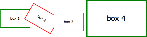
Below we've placed four identical DIV's styled as a 100 x 60 pixel box with a 2 pixel border. Subsequently, each element has been transformed in some way using the transform property:
| box 1 | Translated to the right: transform: translate(3em,0); |
| box 2 | Rotated 30 degrees clockwise: transform: rotate(30deg); |
| box 3 | Translated to the left and down: transform: translate(-3em, 1em); |
| box 4 | Scaled to twice its original size: transform: scale(2); |
The HTML and CSS code for this example is as follows:
<style>

  .boxes {
    display: flex;
    flex-flow: row nowrap;
  }
  .boxes > div {
    flex: 1;
    margin: 4em 1em;
    border: 2px solid green;
    background-color: #fff;
    line-height: 60px;
    text-align: center;
  }

</style>

<div class="boxes">
  <div style="transform: translate(3em, 0);">box 1</div>
  <div style="transform: rotate(30deg); border-color: red;">box 2</div>
  <div style="transform: translate(-3em, 1em);">box 3</div>
  <div style="transform: scale(2);">box 4</div>
</div>
Without the translations, and the red border on the second box, you would see just four identical boxes labelled one through four. What you see in supported browsers (Safari, Chrome, Firefox, Opera), however, will be more like this:
Of note is the fact that the text is still selectable in transformed elements, even when rotated, and that scaling an element affects properties including border widths and font sizes and not just the box dimensions.
Animating your Transforms
While CSS Transformation in itself is a powerful tool for developers (though I shudder to think what will happen as it becomes more widely used), the ability to animate the same effects using transition is far more exciting. Move your mouse over the following four boxes for a demonstration:
What you see above is the four boxes from the previous section in their default states. When you mouseover any of the boxes, however, the CSS transformation is applied as a one second animation. When the mouse moves away the animation reverses, taking each box back to its original state.
And we can do this without using JavaScript - only HTML and CSS! Here is the complete code for 'box 1' which slides to the right and back:
<style>

  .boxes > div {
    margin: 4em 1em;
    border: 2px solid green;
    background-color: #fff;
    line-height: 60px;
    text-align: center;
    -webkit-transition: 1s ease-in-out;
    -moz-transition: 1s ease-in-out;
    -o-transition: 1s ease-in-out;
    transition: 1s ease-in-out;
  }
  .boxes > div.slideright:hover {
    -webkit-transform: translate(3em, 0);
    -moz-transform: translate(3em, 0);
    -o-transform: translate(3em, 0);
    -ms-transform: translate(3em, 0);
    transform: translate(3em, 0);
  }

</style>

<div class="boxes">
  <div class="slideright">box 1</div>
</div>
If you think that's cool, realise that CSS Animation can be applied not just to the transforms, but also to other CSS properties including: opacity, colour and a bunch of others.
In the next example the box on the left begins as small and green with square corners, while the one on the right is larger, with a red border and rounded corners. Hovering over either of the boxes will trigger an animation that makes box 1 take on the appearance of box 2 and vice versa.
Again, we're still only using HTML and CSS to make this happen. Without CSS Transforms the two boxes will still change their border-color, and possibly also the border-radius, but it happens immediately rather than as a one second animation.
For more advanced examples you can read our new article on using JavaScript to trigger the animation. And for an alternative to CSS transitions, and finer control over the animation paths and timing, you can use Window.requestAnimationFrame.
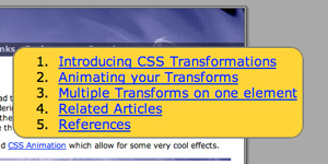
Multiple Transforms on one element
To apply more than one transformation to a single element simply list them one after another separated by spaces. The submenu for example at the top right of this page has the following styles:
<style>

  #submenu {
    background-color: #eee;
    -webkit-transition: 1s ease-in-out;
    -moz-transition: 1s ease-in-out;
    -o-transition: 1s ease-in-out;
    transition: 1s ease-in-out;
  }
  #submenu:hover {
    background-color: #fc3;
    -webkit-transform: rotate(360deg) scale(2);
    -moz-transform: rotate(360deg) scale(2);
    -o-transform: rotate(360deg) scale(2);
    -ms-transform: rotate(360deg) scale(2);
    transform: rotate(360deg) scale(2);
  }

</style>
This means that when you hover over the submenu, it will change colour, rotate and double in size over a period of one second as shown here:
 |
<=> |  |
These effects are now available in the latest public release of Safari, so in principle all OSX users will be able to see these effects. Whether it's a good idea to add them to your website I'll leave up to you.
Animations in action
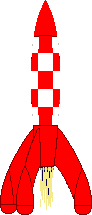
Now here's another example of the kind of fun we can have in combining different effects into single animation. Perhaps you can already work out what's going to happen based on the CSS?
<style>

  /* initial state */

  #outerspace {
    position: relative;
    height: 400px;
    background: #0c0440 url(/images/outerspace.jpg);
    color: #fff;
  }
  div.rocket {
    position: absolute;
    bottom: 10px;
    left: 20px;
    transition: 3s ease-in;
  }
  div.rocket > div {
    width: 92px;
    height: 215px;
    background: url(/images/rocket.gif) no-repeat;
    transition: 2s ease-in-out;
  }

  /* hover final state */

  #outerspace:hover > div.rocket {
    transform: translate(540px,-200px);
  }
  #outerspace:hover > div.rocket > div {
    transform: rotate(70deg);
  }

</style>
and the HTML:
<div id="outerspace">
  <div class="rocket">
    <div><!-- rocket --></div>
    .rocket
  </div>#outerspace
</div>
Put them together and this is the what you get:
If you're using Safari 3 you may notice some problems with the animation, particularly when it reverses after you move the mouse away, but in the latest version of WebKit it's already much smoother. Also the animation in Opera is a bit erratic, with not all the elements being animated.
The dotted outline that appears during the animation shows the placement of the DIV containing the rocket image. This DIV translates across the screen while the image inside is rotated. Simple!
For the browser-impaired what's happening is that when you move the mouse over the space background, the rocket translates from the bottom left to the top right over a period of 3 seconds (translate()) and also rotates 70 degrees in a clockwise direction over the first 2 seconds (rotate()). The effect is rudimentary, but shows potentional.
To have more control over the animation paths and timing, you can set up WebKit Keyframes. They also allow the animations to run automatically and continuously rather than just in response to mouse events.
Multiple timing functions
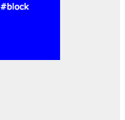
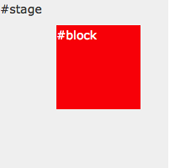
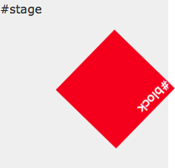
In this example we are applying four different transitions using four different timing functions.
When you :hover over the area to the right the blue box will spin, change color from red to blue and move from the top left of the containing box to the bottom right over two seconds.
The first thing you will notice is that that the movement of the box appears to be curved rather than straight. That's because we've used the ease-out timing function for the horizontal translation and ease-in for the vertical.
To properly animate objects over a curved path, or even an arbitrary path, you will need to use JavaScript to control the animation.
During the animation, the colour change from blue to red takes place over the first second of the two second transition, followed by the rotation which takes place over the second second.
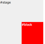
The trick to this is that instead of defining the transition as a single property, you can break it up into component parts. We've also made use of transition-delay which allows you to set the starting point of different effects.
Here are the relevant CSS statements:
<style>

  #block {
    ...
    left: 0;
    top: 0;
    ...
    background: blue;
    ...
    transition-property: left, top, background, transform;
    transition-timing-function: ease-out, ease-in, linear, ease-in-out;
    transition-delay: 0, 0, 0, 1s;
    transition-duration: 2s, 2s, 1s, 1s;
    ...
  }
  #stage:hover #block {
    left: 100px;
    top: 100px;
    background: red;
    transform: rotate(360deg);
   ...
  }

</style>
The rules affecting the background colour transition have been highlighted. They take place over the first second (0s delay, 1s duration). The rotation transform takes place in the next second (1s delay, 1s duration).
Unlike other browsers Firefox requires units to be specified even for zero values in transition-delay, so 0s, 0s, 0s, 1s will work for the example above. For best practice you should include seconds for all CSS time values.
Hover over one element to affect another
A couple of people have asked about triggering animations in relation to a click or hover event elsewhere on the page. With JavaScript this can be done by using an event handler to set or change the className of the element to be animated, and to have a transformation or keyframes associated with the new class.
Using CSS there are some options for targeting related elements. These involve selectors such as the > (child), + (adjacent sibling) and ~ (general sibling) combinators.
The preceding examples all required a direct hover event either on the element itself or on its container, wheras in this example the blue box is animated only when you hover over its sibing, the red box:
The relevant CSS code is as follows. Note that we are using the + adjacent sibling combinator to target #box2 when #box1 experiences a hover event. The ~ combinator may be more flexible in letting you target elements that are further away from the triggering element (some examples).
<style>

  #box2 {
    position: absolute;
    left: 120px;
    ...
    background: blue;
    ...
    transition: 1s ease-in-out;
  }

  #box1:hover + #box2 {
    transform: rotate(360deg);
    left: calc(100% - 102px);
    background: yellow;
  }

</style>
Internet Explorer 11 fails trying to animate when the values have been assigned using calc(). You will need to use a fixed value instead if you want to support MSIE 11. It is also not possible to animate from left: 0 to right: 0.
Of course we can still animate the first box at the same time as targeting its sibling or siblings:
Just be sure not to move the hovered element out from under the pointer or the animation will stop/reverse.
These examples work more or less as intended in WebKit (Safari, Chrome), Firefox and Opera browsers. They also work in Internet Explorer 10.
Controlling the reverse animation
In all the examples above you may have noticed some strange effects when the animation is reversed - particularly when the mouse moves away from the trigger area before the animation has completed.
The box in the animation below will rise up slowly and then shoot off to the right useing an extreme cubic-bezier timing function, making it start off quickly and then slow down at the end.
The CSS for the above example is as follows:
<style>

  #stage {
    position: relative;
    height: 4em;
    background: #efefef;
    text-align: center;
  }

  #stage > #box {
    position: absolute;
    left: 0;
    bottom: 0;
    width: 100px;
    background: red;
    line-height: 2em;
    color: #fff;
    transition: 1s 0s bottom, 1s 1s left cubic-bezier(0,1,1,1);
  }
  #stage:hover > #box {
    left: calc(100% - 100px);
    bottom: 2em;
  }

</style>
Note that when you move your mouse away the box will not track back over the same path. Instead the vertical animation will come first followed by the horizontal dash. For a solution to this keep reading below.
As alluded to above it is possible to control the animation in both directions. In this case causing the animation to perform everything in reverse:
The trick is to move to original transition settings to the :hover statement and for the 'non-hover' to use a transition that reverses them:
<style>

  #stage {
    position: relative;
    height: 4em;
    background: #efefef;
    text-align: center;
  }

  #stage > #box {
    position: absolute;
    left: 0;
    bottom: 0;
    width: 100px;
    background: red;
    line-height: 2em;
    color: #fff;
    transition: 1s 1s bottom, 1s 0s left cubic-bezier(1,0,1,1);
  }
  #stage:hover > #box {
    left: calc(100% - 100px);
    bottom: 2em;
    transition: 1s 0s bottom, 1s 1s left cubic-bezier(0,1,1,1);
  }

</style>
This can be useful for button and menu effects to make an element on the page appear quickly and then fade out slowly, or vice versa.
Remember that the transitions set in the :hover statement are the ones that will be used as the hover state is applied. The 'default' transition settings will be used when returning to the default state.
Translations
References
Related Articles - Transforms and Transitions
- CSS Transition Timing Functions
- CSS Bouncing Ball Animation
- CSS Animation Using CSS Transforms
- CSS 3D Transforms and Animations
- CSS Animated Background Gradients
- CSS Upgraded fading slideshow
- CSS Infinite Animated Photo Wheel
- CSS Photo Rotator with 3D Effects
- CSS An actual 3D bar chart
- JavaScript CSS Animated Fireworks
- JavaScript Animating objects over a curved path
- CSS Fading slideshow with a touch of JavaScript
- JavaScript Controlling CSS Animations
User Comments
Most recent 20 of 41 comments:
Post your comment or question
Cara K 24 April, 2022
Thank you for this explanation! Really helped me understand :hover better
Im currently looking for a way to animate a single div when clicking on it. :activate only seems to work well for links and I don't want to influence any other divs on the website
Do you have any idea what could be the solution? Thank you!!
Instead of :activate you can use a JavaScript onclick event to add a class to the element, and then CSS to apply the animation.
Mario G 1 September, 2019
Congratulations vermante for the work you do. I would like to ask a question even if it could seem bale, is it possible to apply the effect: "2. Animating your Transforms" on images?
Thank you
Yes, the transforms will work on any HTML content
harsh 11 August, 2019
Thanks for such a beautiful explanation, could you please suggest what approach should I take, so child elements are positioned using transform property inside parent div now the issue is when the size of the parent is increased the child divs transform value remains same.
I want the position of the child elements to be relative wrt to the parent divs size increasing so that child divs can maintain there positions otherwise they tend to go out of the parent container.
peter 26 January, 2019
Is it possible to move an element ***relative to it's actual position*** purely in CSS?
You can 'move' an element by setting "position: relative;" or "position: absolute;" and then changing the top/right/bottom/left or margin-* CSS styles. A CSS transition-timing-function can then animation the move.
But there's no native function AFAIR to 'move 10px to the right from current position'.
Visitor 16 October, 2015
Thank you so much for this! It's been a great help for us visitors who want to learn Animation using CSS. Btw, can you add more examples? Like a light bulb turning it on and off.
Kaboom 3 December, 2014
You said that there's some extra code for moving outerspace behind the rocket. Where is that extra code?:) i just wonder... i tried to find it in your linked css, but you have it probably hidden somewhere? how can you hide some css from user? it would be quite helpful to know
No, you can't hide CSS from the user because the browser has to be able to read it and that makes it accessible through the built in 'Web Inspector'. In this case it's the Google PageSpeed module that has minified and moved the CSS in the HTML code.
Texter und Webdesigner 22 May, 2014
Thanks for that comprhensive explanation! A lot of work done very well!
I just don't get how the moving background of the rocket is done... am I just overreading the important line? I just see the code for the moving div and the rotating conent?
There's some extra code for the moving background:
#outerspace {background: #0c0440 url(/images/outerspace.jpg);
background-position: left bottom;
}
#outerspace:hover {
background-position: -50% bottom;
}
Casey Leask 14 August, 2013
-ms-transition never saw the light of day. See github.com/Compass/compass/commit/2973503013a67b958b579f17f6850499164536a8 and github.com/Compass/compass/issues/924 for details.
Thanks for the update. It seems that the -ms- prefix only worked/works in IE10 Preview and is now not necessary. I assume it's still recognised by IE10 if the unprefixed style is missing?
DevMan 20 April, 2013
Works in IE10...
Mark 9 April, 2013
Take a look at this one to see how far you can go with ONLY css
markqian.com/css3
Christopher Bergin 29 March, 2013
great page. I'll bookmark it for reference and use it whenever I would like to provide simple animation without the need for scripting
markosansa 18 December, 2012
Good code but what's about is browser's compatibility ?
The transformations (shift, rotate, scale) are all working in IE9, but not the animations. In IE10 the animations should also work.
Ben Lozano 2 August, 2012
This is an interesting article. I have to take issue with the fact that you called some of the transitions shown "animations". CSS3 defines "animations" as well as "transitions," and the two are not interchangeable.
Animation: "the rapid display of a sequence of images to create an illusion of movement".
You can create animations using either CSS Transitions, as shown above, or with CSS Animation (using @keyframes). A "transition" is simply a change of state which can now be stretched out (i.e. animated) using transition timing functions.
nemo 17 July, 2012
I think it'd be best if you simply specified always using units. Your advice at present suggests using -moz-transition-delay: 0s, 0s, 0s, 1s only.
Since Firefox has unprefixed in nightlies, not using units everywhere means people will do "transition-delay: 0, 0, 0, 1s" and at some point that will break.
The exact reading of the spec seems pretty clear that unitless is not an option - so in fact the syntax you are using is a bug. At some point we'll want to get away from vendor prefixes, so best to fix this now.
So far it's only Firefox that 'drops' the transition-delay value of '0' for having no units specified. The reasoning seems to be that in a potential future short-hand property the '0' could be ambiguous with a numeric value for 'iteration count' or similar.
So yes, to be safe you should use '0s' instead of '0' as that will work for all browsers currently supporting transitions.
josinhoka 9 July, 2012
@Luca add this line on firefox and will work fine -moz-transition-duration: 1s;
Hannes Gerlach 16 June, 2012
Hello, I've found your post unbelievable helpful, but there is one question I couldn't figure out after all. In number 6. you explained how to work with hovering and I used it to give extra information while hovering over a adjecent <div>.
What I would like would be the option for the information to stay visible for the event that the div is clicked. And for the information to vanish again after clicking for a second time.
I imagined that it could work as it works with links( :visited etc. ). Sadly thats not the case. Is there a known possibility or an other mechanic I could try?
You will need to use JavaScript - an "onclick" event that changes the 'class' either of the element that is clicked or the one that moves, and then changes it back on the next click.
Website Design Bangladesh 23 May, 2012
has anyone found a solution to autostart the animation. I've seen a website where clods flow from left to right and doesn't depend on mouse action. apparently the guy didn't use javascript for this. Wondering how he did it!
The CSS solution for auto-starting an animation is to use keyframes
Lee Marshall 19 May, 2012
I really need to find time to work with these animations/transitions. It's funny when you look back and can see how many times you could have used these in the past.
There's no point in animation just for the heck of it, but for the occasional wow factor.
The ability to reveal text with the animations gives them real world application in web design.
André Reitz 27 April, 2012
Great and detailed post!
Transactions that animates the background position doesn't work on Opera. Just for information.
And it seems to have no alternative solution!
If you guys find out how, please let me know!
thx
Azuki 23 March, 2012
This is a great tutorial. Thanks for breaking it down so well!
I have a question about #6 above (Hover over one element to affect another). In your example, is there a way to also trigger an animation for Box#1 while also still animating Box#2?
I've tried using the combinators ~ and + without success (both elements are siblings of the same parent div). I'd really appreciate any ideas you have about accomplishing this in CSS!
Thanks!
I've added an example of this now