
CSS: 3D Transforms and Animations
3D Transforms were first implemented by the Safari/WebKit team ages ago. Support in other browsers is still variable, but getting better.
CSS3 animation and 2D transforms have been implemented in Safari, Firefox, Opera and even Internet Explorer 10, but in this article we're taking it a step further using keyframes to set up perpetual animation effects in 3D space.
These effects will work in WebKit (Safari/iPhone/iPad and Chrome) and Mozilla (Firefox) browsers. Some simpler effects will work in Internet Explorer 10, but they don's support the preserve-3d setting needed for proper 3D layouts.
Setting up Keyframes
What are keyframes?
A @-webkit-keyframes block contains rule sets called keyframes. A keyframe defines the style that will be applied for that moment within the animation. The animation engine will smoothly interpolate style between the keyframes.
While this may sound complicated, and can be, we're starting with one of the most simple examples. The keyframes block defined here will simply rotate an element or group of elements counter-clockwise around the Y-axis (which points towards the top of the page):
<style>

  /* WebKit and Opera browsers */
  @-webkit-keyframes spinner {
    from { -webkit-transform: rotateY(0deg);    }
    to   { -webkit-transform: rotateY(-360deg); }
  }

  /* all other browsers */
  @keyframes spinner {
    from {
      -moz-transform: rotateY(0deg);
      -ms-transform: rotateY(0deg);
      transform: rotateY(0deg);
    }
    to {
      -moz-transform: rotateY(-360deg);
      -ms-transform: rotateY(-360deg);
      transform: rotateY(-360deg);
    }
  }

</style>
In this example the keyframe has been assigned the name 'spinner' for later reference. Additional steps, between 'from' and 'to', can be inserted, each one using a percentage value instead of the from/to keywords, and they can contain different types of styles and transformations.
Setting the stage for our animation
The 'stage' is the element in which our animation takes place. The animation will move and rotate in relation to the stage element, which itself remains fixed to the page.
The optional perspective attribute defines how extreme the 3D effect will be as elements move up and down the Z-axis (come out of the page). The larger this distance the less obvious the effect. Without this attribute there is no perspective effect at all.
<style>

  #stage {
    margin: 1em auto;
    -webkit-perspective: 1200px;
    -moz-perspective: 1200px;
    -ms-perspective: 1200px;
    perspective: 1200px;
  }

</style>
The next element is the one to which the animation is applied. We do this by referring to the keyframes by name. We also define a transition timing function and set the number of iterations (or infinite in this case for perpetual motion). Each iteration will last 6 seconds.
You can assign different timing functions for each individual keyframe in the block if you want to create more physically realistic animations.
<style>

  #spinner {
    -webkit-animation-name: spinner;
    -webkit-animation-timing-function: linear;
    -webkit-animation-iteration-count: infinite;
    -webkit-animation-duration: 6s;

    animation-name: spinner;
    animation-timing-function: linear;
    animation-iteration-count: infinite;
    animation-duration: 6s;

    -webkit-transform-style: preserve-3d;
    -moz-transform-style: preserve-3d;
    -ms-transform-style: preserve-3d;
    transform-style: preserve-3d;
  }

  #spinner:hover {
    -webkit-animation-play-state: paused;
    animation-play-state: paused;
  }

</style>
The hover effect will pause the animation when the mouse is over the element. This property can also be toggled between 'running' and 'paused' using JavaScript to control the state of the animation.
The preserve-3d setting is important if you want to be able to transform other elements with relation to this one, which we do. Without this all child elements are rendered flat in the same plane.
Prior to Chrome 12.0 neither the perspective nor preserve-3d attribute was recognised so the 3D animations where all 'flattened'. This has been addressed for later versions, but preserve-3d is still missing as of Internet Explorer 11.
One interesting effect can be achieved by setting the timing function to 'ease-in-out' and adding a new property -webkit-animation-direction: alternate;. This will result in an animation that spins first one way and then the other.
Spinning an element on the page
At this point we already have all the ingredients required to place an element on the page and set it spinning, as you can see here:
Stop, I'm getting dizzy!
<div id="stage" style="background: rgba(0,0,0,0.5);">
<p id="spinner" style="background: rgba(0,0,0,0.5); text-align: center; color: #fff;">Stop, I'm getting dizzy!</p>
</div>
Both the 'stage' and the paragraph have been assigned a semi-transparent background so you can see the 3D effect as the paragraph rotates. By default the rotation axis is the centre of the 'stage' element, but that can be moved by setting the transform-origin attribute away from the centre.
Creating a photo carousel
As a demonstration, we're now going to build a 'carousel' of images rotating around the vertical axis - similar to a slide projector. In addition to the above styles, we now assign position: absolute to each image child of the spinner element, and some formatting:
<style>

  #spinner img {
    position: absolute;
    border: 1px solid #ccc;
    background: rgba(255,255,255,0.8);
    box-shadow: inset 0 0 20px rgba(0,0,0,0.2);
  }

</style>
If you also set -webkit-backface-visibility: hidden; on the img elements then any facing away from the screen will be hidden rather than displayed in reverse, leaving you with just half the animation.
You can download all the required styles here: 3d-transforms.css
Finally, here's the HTML markup for five randomly selected photos:
<div id="stage" style="padding-left: 180px; height: 160px;">
  <div id="spinner" style="-webkit-transform-origin: 180px 0 0;">
    <img style="-webkit-transform: rotateY(0deg) translateX(180px); padding: 0 0 0 160px;" src="images/beach1.jpg" width="200" height="160" alt="">
    <img style="-webkit-transform: rotateY(-72deg) translateX(180px); padding: 0 0 0 147px;" src="images/beach2.jpg" width="213" height="160" alt="">
    <img style="-webkit-transform: rotateY(-144deg) translateX(180px); padding: 0 0 0 120px;" src="images/beach3.jpg" width="240" height="160" alt="">
    <img style="-webkit-transform: rotateY(-216deg) translateX(180px); padding: 0 0 0 147px;" src="images/beach4.jpg" width="213" height="160" alt="">
    <img style="-webkit-transform: rotateY(-288deg) translateX(180px); padding: 0 0 0 122px;" src="images/beach5.jpg" width="238" height="160" alt="">
  </div>
</div>
To make things easier to start with, all the images have the same height, so we just needed to adjust the padding on the inside edge to have them join up at the central axis. If the heights vary you also need vertical padding. You can do away with the padding altogether if you want, but it becomes more useful as more images are added.
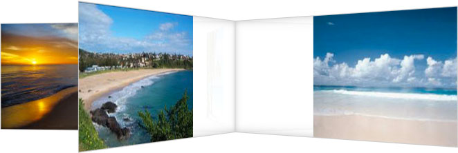
And here's the final product!


The result in Safari 5 looks something like the snapshot below, with the photo on the right coming towards you and the others moving away.
Internet Explorer 10 and 11 still do not support the preserve-3d property so the result is flattened rather than three-dimensional.
The whole construction is rotating a full circle every 6 seconds. There is some transparency in the white inner section letting you see parts of photos in the background:
It may look complicated, but luckily for you we've written a short PHP script to set up a spinning carousel for any number of images:
<?PHP
  // Original PHP code by Chirp Internet: www.chirpinternet.eu
  // Please acknowledge use of this code by including this header.

  $size = array();
  $rotation = $maxw = $maxh = 0;

  // identify images to display
  $dirlist = glob("images/beach*.jpg");
  $num = count($dirlist);

  // calculate the largest image dimensions
  for($i=0; $i < $num; $i++) {
    $img = $dirlist[$i];
    $size[$i] = getimagesize($img);
    if($size[$i][0] > $maxw) $maxw = $size[$i][0];
    if($size[$i][1] > $maxh) $maxh = $size[$i][1];
  }

  // display the carousel html
  echo "<div id=\"stage\" style=\"padding-left: ",($maxw*3/4),"px; height: {$maxh}px;\">\n";
  echo "<div id=\"spinner\" style=\"-webkit-transform-origin: ",($maxw*3/4),"px 0 0;\">\n";
  for($i=0; $i < $num; $i++) {
    $img = $dirlist[$i];
    $padleft = ($maxw - $size[$i][0]);
    $padh = ($maxh - $size[$i][1]) / 2;
    echo "<img style=\"-webkit-transform: rotateY(-",round($rotation,1),"deg) translateX(",($maxw*3/4),"px); padding: {$padh}px 0 {$padh}px ",($padleft + $maxw/2),"px;\" src=\"$img\" {$size[$i][3]} alt=\"\">\n";
    $rotation += 360 / $num;
  }
  echo "</div>\n";
  echo "</div>\n\n";
?>
This code sets the padding at the centre of the carousel to half the width of the widest image. It should work for any number of images.
Photos on a rotating polygon
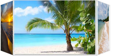
With the exact same style settings, and only a few changes to the code, we have have the same photos displaying on the outside of a rotating polygonal column:
All that has changed is the last section of code, which has been replaced with the following:
<?PHP
  // display the rotating polygon
  $radius = floor($maxw / (2 * tan(deg2rad(180/$num))));
  echo "<div id=\"stage\" style=\"width: {$maxw}px; height: {$maxh}px;\">\n";
  echo "<div id=\"spinner\">\n";
  for($i=0; $i < $num; $i++) {
    $img = $dirlist[$i];
    $padw = ($maxw - $size[$i][0]) / 2;
    $padh = ($maxh - $size[$i][1]) / 2;
    echo "<img style=\"-webkit-transform: rotateY(",round($rotation, 1),"deg) translateZ({$radius}px); padding: {$padh}px {$padw}px;\" src=\"$img\" {$size[$i][3]} alt=\"\">";
    $rotation += 360 / $num;
  }
  echo "</div>\n";
  echo "</div>\n";
?>
For non-supported browsers, here is a snapshot:
Again, this code will scale up (or down) for any number of photos, though the width of the rotating structure increases rapidly for larger numbers. You can find a much nicer solution here.
For a larger set of images, I would suggest loading only a small number to start with, and then use JavaScript to replace images as they rotate out with new ones from the queue.
Tweaking the keyframes timing
As mentioned above, using different transition timing functions can make the animation more appealing. The problem is that it's difficult to set up unless you know exactly how many elements you're dealing with.
For this example, we're going to re-use the above example, which we know has five sides, and set up a keyframe to display them to best effect. We've called the new keyframes spinner5 because it's optimised for display five sides in sequence:
<style>

  @-webkit-keyframes spinner5 {
    from,15% { -webkit-transform: rotateY(0deg);    }
    20%,35%  { -webkit-transform: rotateY(-72deg);  }
    40%,55%  { -webkit-transform: rotateY(-144deg); }
    60%,75%  { -webkit-transform: rotateY(-216deg); }
    80%,95%  { -webkit-transform: rotateY(-288deg); }
    to       { -webkit-transform: rotateY(-360deg); }
  }

  @keyframes spinner5 {
    from,15% {
      -moz-transform: rotateY(0);
      -ms-transform: rotateY(0);
      transform: rotateY(0);
    }
    20%,35%  {
      -moz-transform: rotateY(-72deg);
      -ms-transform: rotateY(-72deg);
      transform: rotateY(-72deg);
    }
    40%,55%  {
      -moz-transform: rotateY(-144deg);
      -ms-transform: rotateY(-144deg);
      transform: rotateY(-144deg);
    }
    60%,75%  {
      -moz-transform: rotateY(-216deg);
      -ms-transform: rotateY(-216deg);
      transform: rotateY(-216deg);
    }
    80%,95%  {
      -moz-transform: rotateY(-288deg);
      -ms-transform: rotateY(-288deg);
      transform: rotateY(-288deg);
    }
    to {
      -moz-transform: rotateY(-360deg);
      -ms-transform: rotateY(-360deg);
      transform: rotateY(-360deg);
    }
  }

</style>
We then need to modify the style settings for the 'spinner' to reference the new keyframes and to make some changes to the timing and duration:
<style>

  #spinner {
    -webkit-animation-name: spinner5;
    -webkit-animation-timing-function: ease-out;
    -webkit-animation-iteration-count: infinite;
    -webkit-animation-duration: 20s;

    animation-name: spinner5;
    animation-timing-function: ease-out;
    animation-iteration-count: infinite;
    animation-duration: 20s;

    -webkit-transform-style: preserve-3d;
    -moz-transform-style: preserve-3d;
    -ms-transform-style: preserve-3d;
    transform-style: preserve-3d;
  }

</style>
The result, which you see here, is much more user-friendly. During each 20-second iteration, each photo is displayed still for 3 seconds, followed by a rotation to the next face which takes only 1 second.
The difficulty in setting this up for any number of photos is that keyframes only allows percentage and not fractional settings, so some of the values would need to be approximated. Also we need to add a new keyframe for each photo added.
Rotating cube
One last example, a bit more complex that the previous which just involved rotations around one axis. Here we set up a cube with six faces that rotate in order.
We start by using CSS to style and place the six faces of the cube. Each side will be marked up as a div child of the 'spinner' element:
<style>

  #spinner div {
    position: absolute;
    width: 120px;
    height: 120px;
    border: 1px solid #ccc;
    background: rgba(255,255,255,0.8);
    box-shadow: inset 0 0 20px rgba(0,0,0,0.2);
    text-align: center;
    line-height: 120px;
    font-size: 100px;
  }

  #spinner .face1 { -webkit-transform: translateZ(60px);                                }
  #spinner .face2 { -webkit-transform: rotateY(90deg) translateZ(60px);                 }
  #spinner .face3 { -webkit-transform: rotateY(90deg) rotateX(90deg) translateZ(60px);  }
  #spinner .face4 { -webkit-transform: rotateY(180deg) rotateZ(90deg) translateZ(60px); }
  #spinner .face5 { -webkit-transform: rotateY(-90deg) rotateZ(90deg) translateZ(60px); }
  #spinner .face6 { -webkit-transform: rotateX(-90deg) translateZ(60px);                }

</style>
If you don't want to see the backs of images in the background you can also set -webkit-backface-visibility: hidden; on the face elements.
Then we set up a keyframe animation sequence to rotate the cube to that each face is presented to the front in order:
<style>

  @-webkit-keyframes spincube {
    from,to  { -webkit-transform: rotateX(0deg) rotateY(0deg) rotateZ(0deg); }
    16%      { -webkit-transform: rotateY(-90deg);                           }
    33%      { -webkit-transform: rotateY(-90deg) rotateZ(90deg);            }
    50%      { -webkit-transform: rotateY(-180deg) rotateZ(90deg);           }
    66%      { -webkit-transform: rotateY(90deg) rotateX(90deg);             }
    83%      { -webkit-transform: rotateX(90deg);                            }
  }

  #spinner {
    -webkit-animation-name: spincube;
    -webkit-animation-timing-function: ease-in-out;
    -webkit-animation-iteration-count: infinite;
    -webkit-animation-duration: 12s;
    -webkit-transform-style: preserve-3d;
    -webkit-transform-origin: 60px 60px 0;
  }

</style>
The HTML markup is fairly simple:
<div class="stage" style="width: 120px; height: 120px;">
  <div class="cubespinner">
    <div class="face1">1</div>
    <div class="face2">2</div>
    <div class="face3">3</div>
    <div class="face4">4</div>
    <div class="face5">5</div>
    <div class="face6">6</div>
  </div>
</div>
To have the animation working in Firefox you just need to substitute -moz- for -webkit- in the above styles. Using -ms- will have some effect in Internet Explorer 10, but you will see only a flattened version of the cube.
Each rotation will take place over 2 seconds. Here's the result:
Here you can find a standalone example of the cube, and copy the complete HTML and CSS code which should work in Safari, Chrome, Firefox and Opera:
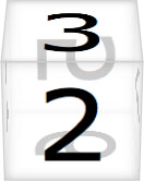
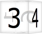
Finally, some screen grabs for non-supported browsers:
 >
>  >
> 
On each face you have have any HTML content you want, including (selectable) text, images, (clickable) links, or video content. You could even use a similar effect to refresh content for the entire page.
If you do find any good uses for these examples, please let us know using the Feedback form below.
References
Related Articles - Transforms and Transitions
- CSS Transition Timing Functions
- CSS Animation Using CSS Transforms
- CSS Infinite Animated Photo Wheel
- CSS Upgraded fading slideshow
- CSS Bouncing Ball Animation
- CSS An actual 3D bar chart
- CSS Animated Background Gradients
- CSS Photo Rotator with 3D Effects
- CSS 3D Transforms and Animations
- JavaScript CSS Animated Fireworks
- JavaScript Animating objects over a curved path
- CSS Fading slideshow with a touch of JavaScript
- JavaScript Controlling CSS Animations
User Comments
Most recent 20 of 24 comments:
Post your comment or question
wu kang 18 August, 2018
Could you share the codes( "3d-transforms.css" "4. Creating a photo carousel"), because I want to cut out "some transparency in the white inner section".
?! the code is all there on the page. The transparency is created by using rgba() for the background colour.
Denis 5 May, 2017
You could achieve #6 using css animation steps
Aaron 12 December, 2016
Ok so this may or may not be an old topic now but i have just found this post and took the code for the rotating polygon and the keyframes to jsFiddle to change around and see what happens, my goal to try and turn it on its Y axis and then maybe have a couple side by side on different interval times that they spin. I know its not great but all i could get upto was this so anyone interested in changing what i have to my goal. Link jsfiddle.net/vyqdkm28/3/
Thanks in advance
Crelda 15 September, 2016
I've noticed that there is an inconsistency in how chrome displays the animations for the cube. It takes a strange path to number 5. I managed to mitigate the problem slightly by adding an extra rotateY(-270deg) to the 66% keyframe but there is still a kink in the animation path. Any ideas on the cause?
I think we had the same problem and made the same correction. If you look at the code in the box below the demo we use -270deg instead of +90deg as described initially.
Lauren 13 September, 2016
I am interested in using this code to integrate a 3D rotating image of a globe. I only see references to the photo carousel and the cube formation. Is there an easy code substitution to either of those for what I need?
I'm not aware of any way to create a spherical surface using CSS.
Icon Studios 24 June, 2016
Hi developers and designers! and thanks for this amazing CSS animation tutorial!
It works and looks really cool and I'm installing it on a website I'm building for one of my customers right now.
But I can't figure out how to position it in the center of the webpage - it kinda doesn't follow instructions... because it's on position:absolute and I have a static navigation bar and they just don't come along....
If any of you can help me fix this issue I would greatly appreciate it.
Thanks again - and happy coding!
Martin Schwartz - Developer at Icon Studios
Try creating a DIV with "position relative;" where you want the animation to appear, and then any children with "position: absolute;" will be positioned relative to the parent. If that doesn't work, paste a link.
Willie Meier 23 March, 2016
Greetings
I have updated my web site that I split into two; design center and showcase center.
The showcase center uses a Star Wars/Star Trek theme written in HTML5.1 and CSS3 animations which has started me with animations from your web site back in 2012.
The original 3D video cubes is mentioned on the jwplayer.com in the experiment section.
The showcase center has among the original 3D video cube; an exploding 3D video cube; a double rotating 3D video cubes; a photo gallery of the Canadian Rockey Mtns.
enjoy!
regards
Willie
Hans 15 February, 2016
The dice effect at the end is exactly what I wanted to. I'm going to be using it on my dice game adaption of Fallout.
I need to figure out how to do transparency and add more sides, like a octagon (8 sides).
Oliver 30 December, 2014
Hi thx for your great Tutorial,
based on your CSS I build a interactive version with javascript
www.mg-otterson.de/fileadmin/show/transition/cube.html
It works by just adding classes with animations.
If there any suggestion of detecting CSS3_features by javascript, instead of my way, let me know it
That looks really good. Thanks for the link
David 30 November, 2014
Hi want to have "7. Rotating cube" for width: 253px; height: 60px; and RotateY only. Can you help me to adopt please
Something like this is probably easier to adapt. Show me your code if you get stuck
Nud Nuby 18 November, 2014
Hi, Sorry to hassle you with this: I have just loaded the scripts above - testing carousel and polygon. However, in both cases I get only 1 pic (of 5) showing and, in the case of the polygon, it turns on its own axis, ie there is no polygon. Any advice? Tx
Val 8 December, 2013
Thank you so much for doing it without all vendor prefixes so that we need to spend our time to check whether it will work in IE etc or not.
Lost 18 June, 2013
Ive been looking at several 3d transforms but what I really want to do is put a seperate backface image when the image rotates - like a face and back of a playing card. Is this possible, or do the images have to display the backwards image when rotating in the back?
You would need to place another image 1-2 pixels behind the front facing image and then rotate them together.
Chris Lam 27 May, 2013
Is it possible to make the backface opacity down instead of taking it's visiblity off?
I'm pretty sure it's either 'on' or 'off', but with creative layering you could add a semi-transparent background to the rotating elements.
Vincent 26 July, 2012
My 3Dcube was created with this tutorial!
See it @ www.reggaetubewatcher.com/p/animation-css3-cube-3d-24faces.html
Thanks!
Willie Meier 9 July, 2012
Well I've added another example to the web site in the 3Dplaylist section.
The morph-cube is somewhat unique in that it has two cubes an outer an internal which when clicked will play, a video, using the JWPlayer.
When completed or the window closed, the cubes will morph into a carousel to select to video to play.
OR just click on the morph button which will take you to the carousel which when completed will morph into the cubes; crazy, right?
Willie Meier 12 June, 2012
Using html5, CSS3 animation, I've added this past weekend a "Star Wars" crawl in keeping with the overall 'Star Trek' theme.
Works very well with gecko and Webkit rendering engines.
Your tutorials have been a great help, thanks
Very nice
Willie Meier 2 February, 2012
I managed to get a 3D transparent cube working for IE9, FF, Opera and Safari.
Also a rotating cube which for the moment works only in FF and Chrome and Safrai, hoping that in the future that Opera will be supported.
They can be found in the experimental section
In both cases, I use the cube's faces to display video by using the JWPlayer in the html5mode
The 3D rotating cube with video is pretty cool!
molokoloco 22 October, 2011
Thank you so much for this great tutorial
To test it, i have put the code in a jsFiddle, so simple to see what parameters do what jsfiddle.net/molokoloco/7rV7a/
it's a shame that it don't work on other browser...
svn1606 6 October, 2011
Hi, is there a way to pass a dynamic values to the rotateX, rotateY and rotateZ functions?
A good question. You can set the style["WebkitTransform"] property using JavaScript, but you have to set ALL the desired values every time rather than passing incremental values. You can see examples in Controlling CSS Animations.