
CSS: Photo Rotator with 3D Effects
This article is a proof of concept that we can create an 'infinite' photo carousel by using nth-child to hide photos off-screen and then JavaScript to shuffle photos from one end of the array to the other as required.
For a more practical implementation using 3d transforms and keyframes you should look at our Infinite Animated Photo Wheel examples. They are based on the concepts explored here, but use a proper 3D layout and smooth animation.
Currently only Safari and Chrome (WebKit browsers) and Firefox have full support for CSS 3D Transforms, but other browsers have them on the horizon. In Internet Explorer they should become available in version 10.
Building an image Carousel
First the HTML. It's a bit hard to read because we've removed any blank space or carriage returns between the elements. This is so we can more easily reference the different images using JavaScript - a blank space or line creates a new node in some browsers.
<div id="stage">
<div id="rotator"><a href="snow1.jpg"><img src="snow1.jpg" width="140"></a><a href="snow2.jpg"><img src="snow2.jpg" width="140"></a><a href="snow3.jpg"><img src="snow3.jpg" width="140"></a><a href="snow4.jpg"><img src="snow4.jpg" width="140"></a><a href="snow5.jpg"><img src="snow5.jpg" width="140"></a><a href="snow6.jpg"><img src="snow6.jpg" width="140"></a><a href="snow7.jpg"><img src="snow7.jpg" width="140"></a><a href="snow8.jpg"><img src="snow8.jpg" width="140"></a></div>
</div>

<p id="controls"><a href="#" onclick="rollLeft(document.getElementById('rotator')); return false;">←</a>
 <a href="#" onclick="rollRight(document.getElementById('rotator')); return false;">→</a></p>
If we unwrap the HTML it looks like this:
<div id="stage">
<div id="rotator">

<a href="snow1.jpg"><img src="snow1.jpg" width="140"></a>
<a href="snow2.jpg"><img src="snow2.jpg" width="140"></a>
<a href="snow3.jpg"><img src="snow3.jpg" width="140"></a>
<a href="snow4.jpg"><img src="snow4.jpg" width="140"></a>
<a href="snow5.jpg"><img src="snow5.jpg" width="140"></a>
<a href="snow6.jpg"><img src="snow6.jpg" width="140"></a>
<a href="snow7.jpg"><img src="snow7.jpg" width="140"></a>
<a href="snow8.jpg"><img src="snow8.jpg" width="140"></a>

</div>
</div>

<p id="controls"><a href="#" onclick="rollLeft(document.getElementById('rotator')); return false;">←</a>
 <a href="#" onclick="rollRight(document.getElementById('rotator')); return false;">→</a></p>
Remember that you need to use the compacted version for the JavaScript to work properly.
As you can see there's not much there that needs explanation. The gallery is wrapped inside a DIV including a listed of photos/links followed by some navigation links with onclick events.
Laying out photos in 3D space
The styling is a bit more involved. What we're doing here is shaping the first five photos into a concave shape and hiding any extra photos (for now). The outer photos are rotated by 60 degrees and the neighbouring photos by 30 degrees. The central photo is lifted off the page.
<style>

  #stage {
    margin: 1em auto;
    height: 120px;
  }

  #rotator {
    position: absolute;
    white-space: nowrap;
    -webkit-perspective: 1200px;
    -moz-perspective: 1200px;
    perspective: 1200px;
  }

  #rotator a img {
    position: relative;
    padding: 10px;
    border: 1px solid #ccc;
    vertical-align: middle;
  }

  #rotator a:nth-child(1) img {
    -webkit-transform-origin: 100% 50% 0;
    -webkit-transform: rotateY(-60deg);
    -moz-transform-origin: 100% 50% 0;
    -moz-transform: rotateY(-60deg);
    transform-origin: 100% 50% 0;
    transform: rotateY(-60deg);
  }
  #rotator a:nth-child(2) img {
    -webkit-transform-origin: 0 50% 0;
    -webkit-transform: rotateY(-30deg);
    -moz-transform-origin: 0 50% 0;
    -moz-transform: rotateY(-30deg);
    transform-origin: 0 50% 0;
    transform: rotateY(-30deg);
  }
  #rotator a:nth-child(3) img {
    -webkit-transform: translateZ(220px);
    -moz-transform: translateZ(220px);
    transform: translateZ(220px);
  }
  #rotator a:nth-child(4) img {
    -webkit-transform-origin: 100% 50% 0;
    -webkit-transform: rotateY(30deg);
    -moz-transform-origin: 100% 50% 0;
    -moz-transform: rotateY(30deg);
    transform-origin: 100% 50% 0;
    transform: rotateY(30deg);
  }
  #rotator a:nth-child(5) img {
    -webkit-transform-origin: 0 50% 0;
    -webkit-transform: rotateY(60deg);
    -moz-transform-origin: 0 50% 0;
    -moz-transform: rotateY(60deg);
    transform-origin: 0 50% 0;
    transform: rotateY(60deg);
  }
  #rotator a:nth-child(n+6) {
    display: none;
  }

</style>
To reference the individual photo/links we make use of the nth-child pseudo-class. In this case the links (A) are the children of the parent DIV. If there were no links then the children would instead be the IMG elements.
Rotating the photo wheel
The little bit of JavaScript you saw earlier (onclick) calls the following functions. All they do is take an element from one end of the photo array in the DOM and move it to the other:
<script>

  function rollRight(el)
  {
    el.insertBefore(el.lastChild, el.firstChild);
  }

  function rollLeft(el)
  {
    el.appendChild(el.firstChild);
  }

</script>
The JavaScript code should (as almost always) be placed at the bottom of the page.
The first function will take the node containing the last photo/link (visible or hidden) and places it before the first photo/link. The second function takes the first photo/link and moves it to the end of the row. Using onclick is not the most elegant approach, but for now it will suffice.
As the nodes are moved they take on the styles allocated to their new position (1, 2, 3, 4, 5 or 6+) so all we need to do is change their positions and not worry about movement or rotation.
The final product
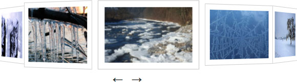
Here you can see an example of the rotating photo carousel in action:


When you click on either of the arrows the photos will shuffle along in that direction. There are 8 photos in total with only five displayed at a time. We've applied a lightbox to these photos which lets you click on any of the three in the centre to zoom in.
As noted at the start this currently only works properly in WebKit browsers, and then with some quirks in Chrome. If you're using a different browser here's a screenshot from Safari:
If you're interested in something more animated you might like our article on 3D Transforms and Animations where we've done something similar only using @keyframes to animate the carousel.
References
Related Articles - Transforms and Transitions
- CSS Transition Timing Functions
- CSS Animation Using CSS Transforms
- CSS Infinite Animated Photo Wheel
- CSS An actual 3D bar chart
- CSS 3D Transforms and Animations
- CSS Upgraded fading slideshow
- CSS Bouncing Ball Animation
- CSS Animated Background Gradients
- CSS Photo Rotator with 3D Effects
- JavaScript CSS Animated Fireworks
- JavaScript Animating objects over a curved path
- CSS Fading slideshow with a touch of JavaScript
- JavaScript Controlling CSS Animations