
CSS: Radial gradients syntax
In this articles we're going to explore the various properties of radial gradient backgrounds as implemented by the WebKit and Gecko rendering engines. Gradients can used as backgrounds, pseudo-images and image masks among other things.
The -webkit styles work already in Safari 4 and the -moz equivalents in Firefox 4.0 Beta. As always, there are differences in the syntax as the CSS3 standards have not been finalised. In fact, WebKit and Mozilla now take a completely different approach.
Syntax for CSS Radial Gradients
The basic syntax we will be working with is for WebKit browsers (Safari, Chrome, iPhone/iPad) is:
background: -webkit-gradient(
  radial, <point>, <radius>, <point>, <radius>[, <stop>]*
) <color>;
The first point and radius define the inner circle of the gradient. Inside the specified area the from() colour will be displayed. The second point and radius define the outer circle. Outside of this area you will see the to() colour. In between these two circles the gradient will be applied.
The point and radius values can be either a percentage or a pixel measurement (without the usual px unit appended).
And for the Mozilla family (Firefox):
background: -moz-radial-gradient(
  [<position>,]? [<shape> || <size>,]? <stop>, <stop>[, <stop>]*
);
Where shape is one of 'circle' or 'ellipse' (the default) and size takes one of the following values: 'closest-side' (contain), 'closest-corner', 'farthest-side', 'farthest-corner' (cover).
The WebKit syntax is apparently based on the SVG canvas model for gradients, while the Mozilla implementation now works more like a 'Fill Gradient' tool in a graphics editor.
WebKit have now announced support for -webkit-radial-gradient and -webkit-repeating-radial-gradient identical to the Mozilla syntax. Also for linear gradients. And they will keep -webkit-gradient for the forseeable future.
As yet the Opera browser does not support radial gradients, though they have added support for linear gradients in 11.10.
Drawing a simple circle using radial-gradient
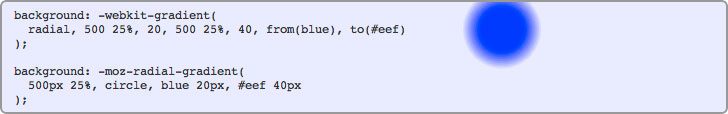
In the code box below we have added a radial gradient centred around a point 500 pixels across and 25% down. The inner circle (solid blue) has a radius of 20px and the outer radius (defining the end of the gradient) has a radius of 40px, so the gradient itself spans the dividing 20 pixels:
background: -webkit-gradient(
  radial, 500 25%, 20, 500 25%, 40, from(blue), to(#eef)
);

background: -moz-radial-gradient(
  500px 25%, circle, blue 20px, #eef 40px
);
If your browser supports it, you will see a solid blue circle with a radius of 20 pixels, surrounded by a blue-to-gray gradient extending outwards a further 20 pixels. Here's a snapshot:
In the following sections we're going to modify different variables so you can see the effect they have.
Changing the radius of the inner circle
In the examples below we are changing the radius of the inner circle from 0 to 50 pixels in 10-pixel increments. You will see the solid portion of the gradient getting larger.
background: -webkit-gradient(
  radial, 500 25%, 0, 500 25%, 40, from(blue), to(#eef)
) #f90;

background: -moz-radial-gradient(
  500px 25%, circle, blue 0px, #eef 40px
);
background: -webkit-gradient(
  radial, 500 25%, 10, 500 25%, 40, from(blue), to(#eef)
) #f90;

background: -moz-radial-gradient(
  500px 25%, circle, blue 10px, #eef 40px
);
background: -webkit-gradient(
  radial, 500 25%, 20, 500 25%, 40, from(blue), to(#eef)
) #f90;

background: -moz-radial-gradient(
  500px 25%, circle, blue 20px, #eef 40px
);
background: -webkit-gradient(
  radial, 500 25%, 30, 500 25%, 40, from(blue), to(#eef)
) #f90;

background: -moz-radial-gradient(
  500px 25%, circle, blue 30px, #eef 40px
);
background: -webkit-gradient(
  radial, 500 25%, 40, 500 25%, 40, from(blue), to(#eef)
) #f90;

background: -moz-radial-gradient(
  500px 25%, circle, blue 40px, #eef 40px
);
background: -webkit-gradient(
  radial, 500 25%, 50, 500 25%, 40, from(blue), to(#eef)
) #f90;

background: -moz-radial-gradient(
  500px 25%, circle, blue 50px, #eef 40px
);
In WebKit, when the two circles are identical, there is no gradient and the default background colour (#f90) fills the container. Also in WebKit, When the radius of the inner circle is larger than the outer circle the gradient is inverted going from grey to blue instead of vice-versa. Neither of these effects are seen in Mozilla so for the last two examples we see just a solid background (#eef).
In WebKit, the gradient behaves like a background image and appears in front of the default background. In Mozilla it behaves more like a background colour, with a gradient applied.
Changing the position of the inner circle
Again, this no longer seems to be possible in Mozilla, so the following will only apply to WebKit browsers.
While the inner circle fits inside the outer circle there is no problem. The gradient is simply squashed on one side and stretched on the other. It's when the edges touch or cross over that you start to see strange effects.
In these cases an 'arrow' is formed using the points of intersection of the two circles and the furthest point of the inner circle. Outside of that arrow the default background is visible.
background: -webkit-gradient(
  radial, 490 25%, 20, 500 25%, 40, from(blue), to(#eef)
) #f90;
background: -webkit-gradient(
  radial, 480 25%, 20, 500 25%, 40, from(blue), to(#eef)
) #f90;
background: -webkit-gradient(
  radial, 470 25%, 20, 500 25%, 40, from(blue), to(#eef)
) #f90;
background: -webkit-gradient(
  radial, 460 25%, 20, 500 25%, 40, from(blue), to(#eef)
) #f90;
background: -webkit-gradient(
  radial, 450 25%, 20, 500 25%, 40, from(blue), to(#eef)
) #f90;
When the inner circle is larger than the outer, the effect is reversed, just as in the previous examples:
background: -webkit-gradient(
  radial, 450 25%, 40, 500 25%, 20, from(blue), to(#eef)
) #f90;
These effects are described mathematically in the WebKit documentation.
Adding more colours to the gradient
As with the linear gradients it's possible to insert more colours and 'color-stop' points. A color-stop specifies a colour for the gradient to 'hit' at a given point between 0, the inner circle of the gradient (equivalent to from()), and 1, the outer circle (equivalent to to()).
Here we have a gradient that transitions from orange to white to light blue. All that is changing between each example is the point at which the first transition is completed and the second one begins:
background: -webkit-gradient(
  radial, 500 50%, 10, 500 50%, 80, from(orange), color-stop(0.2, #fff), to(lightblue)
);

background: -moz-radial-gradient(
  500px 50%, circle, orange 10px, #fff 24px, lightblue 80px
);
background: -webkit-gradient(
  radial, 500 50%, 10, 500 50%, 80, from(orange), color-stop(0.4, #fff), to(lightblue)
);

background: -moz-radial-gradient(
  500px 50%, circle, orange 10px, #fff 38px, lightblue 80px
);
background: -webkit-gradient(
  radial, 500 50%, 10, 500 50%, 80, from(orange), color-stop(0.6, #fff), to(lightblue)
);

background: -moz-radial-gradient(
  500px 50%, circle, orange 10px, #fff 52px, lightblue 80px
);
background: -webkit-gradient(
  radial, 500 50%, 10, 500 50%, 80, from(orange), color-stop(0.8, #fff), to(lightblue)
);

background: -moz-radial-gradient(
  500px 50%, circle, orange 10px, #fff 66px, lightblue 80px
);
And of course we can insert more colours:
background: -webkit-gradient(
  radial, 500 50%, 20, 500 50%, 100, from(red), color-stop(0.2, orange), color-stop(0.4, yellow), color-stop(0.6, green), color-stop(0.8, blue), to(#fff)
);

background: -moz-radial-gradient(
  500px 50%, circle, red 20px, orange 36px, yellow 52px, green 68px, blue 84px, #fff 100px
);
The examples in this section appear identical between WebKit and Mozilla browsers, but you can see that the Mozilla specification isn't really designed for this kind of effect - more for filling entire spaces.
One other trick which you can try out yourself. If you define two color-stops at the same point then that will become a hard edge/transition rather than a gradient.
Filling backgrounds using -moz-radial-gradient
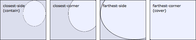
In Mozilla, the size options let you specify the size of the gradient based on the dimensions of the container. The most common options are 'contain' which fits the gradient inside the smallest dimension of the box:
background: -moz-radial-gradient(
  75% 50%, circle contain, red, orange, yellow, #fff
);
and 'cover' which scales the gradient relative to the longest side:
background: -moz-radial-gradient(
  75% 50%, circle cover, red, orange, yellow, #fff
);
If we don't specify 'circle' then the gradient takes on different dimensions according to the containing box:
background: -moz-radial-gradient(
  75% 50%, contain, red, orange, yellow, #fff
);
background: -moz-radial-gradient(
  75% 50%, cover, red, orange, yellow, #fff
);
It might not actually be clear from the examples above that the shape of the ellipse is not actually related to the proportions of the container. Rather the ellipse will take the proportions that allow it to comply with the shape setting:
(contain)
(cover)
And here's a snapshot for if you're not using Firefox. In each case the gradient is centred around the point 3/4 across and 1/3 down. The gradient ellipse used both 'closest-side's and both 'farthest-side's rather than just one as with the circular version.
It's difficult to see how the same effects could be achieved in WebKit for variable size containers...
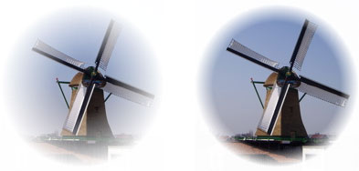
Using radial gradients as image masks
Now to something potentially more interesting for designers and developers, applying radial gradients as image masks using alpha transparency. These effects will currently work only in WebKit browsers.
 |
|
|
| no style settings | -webkit-mask-image: -webkit-gradient( radial, 50% 50%, 30, 50% 50%, 90, from(#fff), to(rgba(0,0,0,0))); |
-webkit-mask-image: -webkit-gradient( radial, 50% 50%, 70, 50% 50%, 90, from(#fff), to(rgba(0,0,0,0))); |
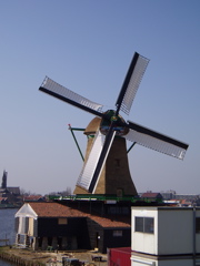
In the above examples the from() and to() colours are not important. It's only the alpha transparency that effects the image mask properties. The radius of the outer circle has been set to half the width of the photo and the two examples show the effects of a small and a large inner circle respectively.
For the browser-impaired, here's how the image mask effect renders in Safari 4:
Repeating radial gradient backgrounds
The old Mozilla sytax for -moz-radial-gradient did allow for radially repeating backgrounds. After the change there's a new syntax -moz-repeating-radial-gradient specifically for this behaviour.
Here you can see a simple gradient with no repetition. We've offset the inner and outer circles so you can see how that effects the repeated gradient:
background: -webkit-gradient(
  radial, 500 50%, 10, 500 50%, 80, from(orange), color-stop(0.2, #fff), to(lightblue)
);

background: -moz-radial-gradient(
  500px 50%, circle, orange 10px, #fff 24px, lightblue 80px
);
and with the background gradient set to repeat:
background: -moz-repeating-radial-gradient(
  500px 50%, circle, orange 10px, #fff 24px, lightblue 80px
);
For those not using Firefox 4 Beta or higher, here's a snapshot:

In WebKit it's a whole different story. There doesn't seem to be an option to have the gradient continue in the same fashion as Firefox (and quite some discussion as to what is 'proper' behaviour). Instead you can create a repeating tile by setting boundaries for the gradient background, effectively creating an image tile:
background: -webkit-gradient(
  radial, 500 50%, 10, 500 50%, 80, from(orange), color-stop(0.2, #fff), to(lightblue)
);
-webkit-background-size: 100% 33%;
The -webkit-background-size option defines a box attached to the top left of the surrounding element. In this case we've set the dimensions to be 100% of the width and 33% of the height. The contents of this box are then automatically tiled to completely fill the element, as you can see in this screenshot from Safari 4:

To make it clearer what's happening, here's an example where we tile the background gradient horizontally by setting its width to 25%:
background: -webkit-gradient(
  radial, 120 50, 10, 120 50, 40, from(white), color-stop(0.1, #c93), color-stop(0.3, pink), color-stop(0.6, pink), color-stop(0.9, #c93), to(white)
);
-webkit-background-size: 25% 100%;
And a preview for those not using Safari 4 or higher:

Mmmmm donuts...
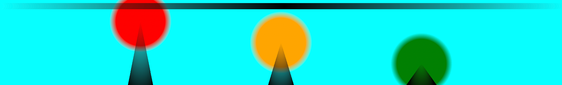
WebKit also allows for multiple gradients to be applied at once, but hopefully you can come up with something more attractive than this mish-mash:
background:
  -webkit-gradient(radial, 100% 10, 5, 0 10, 5, from(rgba(0,0,0,0)), color-stop(0.5, #000), to(rgba(0,0,0,0))),
  -webkit-gradient(radial, 25% 100%, 20, 25% 25%, 0, from(#000), to(rgba(0,0,0,0))),
  -webkit-gradient(radial, 50% 100%, 20, 50% 50%, 0, from(#000), to(rgba(0,0,0,0))),
  -webkit-gradient(radial, 75% 100%, 20, 75% 75%, 0, from(#000), to(rgba(0,0,0,0))),
  -webkit-gradient(radial, 25% 25%, 40, 25% 25%, 50, from(red), to(rgba(255,255,255,0))),
  -webkit-gradient(radial, 50% 50%, 40, 50% 50%, 50, from(orange), to(rgba(255,255,255,0))),
  -webkit-gradient(radial, 75% 75%, 40, 75% 75%, 50, from(green), to(rgba(255,255,255,0))) aqua;
This is what is looks like in the Safari web browser circa 2023:
Got any nice examples you want to share? You can send them to us using the Feedback form below.
References
- Surfin' Safari - Blog Archive » Introducing CSS Gradients
- CSS 3 and The Future: Image-free Rounded Corners, Drop Shadows and Gradients
- Safari Visual Effects Guide: Gradients
- WebKit Radial Gradients Tool
- MDN: -moz-radial-gradient - MDC
Related Articles - Gradients
- CSS Radial gradients syntax
- CSS Linear gradients syntax
Jay Alvarez 26 February, 2011
Hi, I love your clear instructions and examples. I always use your site to copy and paste border radius code from the table as I find it the easiest way to add all three types very quickly. Thanks for that - It's really useful.