
CSS: Infinite Animated Photo Wheel
Our first attempts at using CSS 3D Transforms to create an animated photo carousel were not entirely practical as they were limited to a small number of photos.
We had more luck using CSS to layout the photos in 3D space combined with JavaScript to iterate through the available photos with our Photo Rotator, but it was a bit boring with no movement effects.
So then we wondered what would happen if the two techniques were combined.
The following examples are working in Safari, Chrome, Firefox and Opera. Using Internet Explorer 10 and higher it is possible to reproduce the effects using the -ms- browser prefix and a work-around for the preserve-3d setting (separate @keyframes for each element). Otherwise the 3D animation becomes 2D as you will see.
Setting stage for the animation
The HTML is very similar to previous examples. We have a stage in which the animation will take place, a rotator DIV that will rotate, and a series of images:
<div id="stage">
  <div id="rotator" style="-webkit-animation-name: rotator;">
    <a href="1.jpg"><img src="1.jpg" width="140"></a>
    <a href="2.jpg"><img src="2.jpg" width="140"></a>
    <a href="3.jpg"><img src="3.jpg" width="140"></a>
    <a href="4.jpg"><img src="4.jpg" width="140"></a>
    <a href="5.jpg"><img src="5.jpg" width="140"></a>
    <a href="6.jpg"><img src="6.jpg" width="140"></a>
    <a href="7.jpg"><img src="7.jpg" width="140"></a>
    <a href="8.jpg"><img src="8.jpg" width="140"></a>
  </div>
</div>
The inline style attribute references the animation @keyframes below. It needs to be inline rather than in the CSS in order for us to be able to stop and restart the animation using JavaScript.
Laying out photos in 3D space
The CSS styles are used to position a number of photos by first rotating them about the y-axis (which runs vertically up the page) and then translating them outward radially (a la Stonehenge):
<style>

  #stage {
    margin: 2em auto 1em 50%;
    height: 140px;
    -webkit-perspective: 1200px;
    -webkit-perspective-origin: 0 50%;
  }

  #rotator a {
    position: absolute;
    left: -81px;
  }
  #rotator a img {
    padding: 10px;
    border: 1px solid #ccc;
    background: #fff;
    -webkit-backface-visibility: hidden;
  }

  #rotator a:nth-of-type(1) img {
    -webkit-transform: rotateY(-90deg) translateZ(300px);
  }
  #rotator a:nth-of-type(2) img {
    -webkit-transform: rotateY(-60deg) translateZ(300px);
  }
  #rotator a:nth-of-type(3) img {
    -webkit-transform: rotateY(-30deg) translateZ(300px);
  }
  #rotator a:nth-of-type(4) img {
    -webkit-transform: translateZ(300px);
    background: #000;
  }
  #rotator a:nth-of-type(5) img {
    -webkit-transform: rotateY(30deg) translateZ(300px);
  }
  #rotator a:nth-of-type(6) img {
    -webkit-transform: rotateY(60deg) translateZ(300px);
  }
  #rotator a:nth-of-type(n+7) { display: none; }

</style>
The value of -81px is to move the photos left so that the forward facing photo is centred across the rotation axis. The distance is half the image width (140px/2) plus the LHS image padding (10px) and border (1px).
The stage element is needed to give us a perspective of the animation - making closer elements appear larger. The stage starts at the center of the page, so the anchor elements under rotator elements need to be shifted back to make the animation centred.
We only lay out six photos to start with - three to the left, one in the center and two to the right. The left-most photo (position 1) begins off stage left so only becomes visible after the first rotation.
As a photo rotates out of sight it vanishes (display: none) and a new photo is appended to the left hand side ready to rotate in from position 1. There can be any number of photos in positions 7 and higher. They will each appear only when they are moved into a visible position.
It should be possible even to load new photos using Ajax as the animation progresses - maybe from a webcam or Flickr - so it really does become infinite.
A touch of animation
Rather than rotate the photo wheel a full 360 degrees as we tried previously, what we're actually doing is only rotating 30 degrees - enough to get from one photo to the next:
<style>

  @-webkit-keyframes rotator {
    from { -webkit-transform: rotateY(0deg);  }
    to   { -webkit-transform: rotateY(30deg); }
  }

  #rotator {
    -webkit-transform-origin: 0 0;
    -webkit-transform-style: preserve-3d;
    -webkit-animation-timing-function: cubic-bezier(1, 0.2, 0.2, 1);
    -webkit-animation-duration: 1s;
    -webkit-animation-delay: 1s;
  }
  #rotator:hover {
    -webkit-animation-play-state: paused;
  }

</style>
To get keyframes working in other browsers duplicate all styles replacing -webkit- with -moz- and -ms- as shown in the sample code blocks below. Or do away with prefixes entirely if you only need to support modern browsers.
When the animation completes, it triggers a JavaScript event which you can read about in the next section. The event handler shuffles along the photos so that when the animation resets, instead of going back to the initial state, the photos have all moved a step around the circle.
To make it clearer what's happening the central photo has been highlighted in the demonstration below. As the animation takes place you will see the highlighted node rotate and then reset back to the start position, but containing a different photo.
JavaScript animation controller
We require JavaScript in this example to detect when the animation has ended in order to coordinate the photos moving with the wheel reset. Without this the wheel would only alternate between the first two photos.
<script>

  window.addEventListener("DOMContentLoaded", function(e) {

    var rotateComplete = function(e) {
      target.style.webkitAnimationName = "";
      target.insertBefore(arr[arr.length-1], arr[0]);
      setTimeout(function(el) {
        el.style.webkitAnimationName = "rotator";
      }, 0, target);
    };

    var target = document.getElementById("rotator");
    var arr = target.getElementsByTagName("a");

    target.addEventListener("webkitAnimationEnd", rotateComplete, false);

  }, false);

</script>
For each of the WebKit styles and other references there exist alternatives for Firefox (-moz- or Moz), Opera (-o- or O), and even Internet Explorer (-ms- or ms) - a mess we have to put up with until the standard becomes finalised.
To have this working in Safari, Chrome, Firefox, Opera and Internet Explorer 10 we need to include extra settings as follows:
<script>

  // Original JavaScript code by Chirp Internet: www.chirpinternet.eu
  // Please acknowledge use of this code by including this header.

  var rotateComplete = function(e) {
    with(target.style) {
      webkitAnimationName = MozAnimationName = msAnimationName = animationName = "";
    }
    target.insertBefore(arr[arr.length-1], arr[0]);
    setTimeout(function(el) {
      with(el.style) {
        webkitAnimationName = MozAnimationName = msAnimationName = animationName = "rotator";
      }
    }, 0, target);
  };

  var target = document.getElementById("rotator");
  var arr = target.getElementsByTagName("a");

  target.addEventListener("webkitAnimationEnd", rotateComplete, false);
  target.addEventListener("animationend", rotateComplete, false);
  target.addEventListener("MSAnimationEnd", rotateComplete, false);

</script>
It's not clear why setTimeout is required here. We don't need it to set the delay as that's done using CSS, but without a setTimeout (even of 0ms) the animation fails to be re-triggered.
You can see how it all comes together in the next section.
The final product
Finally we have something that could be useful on a website. You can present photos on a wheel that will loop infinitely and you're not limited as to the number of photos, except that there should be at least the initial six - five displayed and one queued offscreen ready to appear.


The shaded box in the background shows the position of the #stage element. The layout could be improved a bit to make the photos line up vertically, but otherwise it's quite sharp.
Opera now recognises the WebKit syntax. In older versions you can use -o-, oAnimationEnd and OAnimationName.
While animations now work in Internet Explorer 10, using -ms-, MSAnimationEnd and msAnimationName, neither IE10 nor IE11 support preserve-3d which is necessary for nesting 3D transforms. A workaround requires applying separate 3D tranforms to each element in relation to the origin.
Here are some screenshots showing the animation direction (red) and the photo displacement (green) through one cycle in Safari:
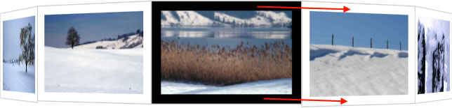
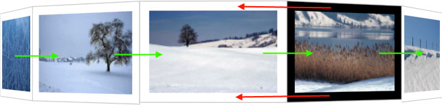
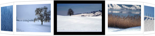
In the second screenshot the animation resets the wheel to the left, triggering our JavaScript to rotate the photos one position right. They occur at the same time and cancel each other out. It's a ratchet.
Example with three faces
With a few minor changes we can used different polygonal shapes for the image wheel, and larger images, creating a different effect. In this case the images are twice as large and placed in a triangular arrangement which uses less space. There are still the same eight photos in the sequence:
Using Firefox you'll see that the animation is also working. In addition to the extra JavaScript code and replacing -webkit with -moz we had to add -moz-transform-style: preserve-3d; to the css for #rotator a as it's not inherited (as of Firefox v12).
A slight change in this example is that we're moving photos from the front of the queue to the back. In the previous case we were moving them from the back of the queue to the front.
To achieve this we replace:
target.insertBefore(arr[arr.length-1], arr[0]);
with:
target.appendChild(arr[0]);
This could be blown up to full-screen to create a screen-saver for your phone, or you could change it to rotate in other directions. Please send us a link if you use it in the wild.
Click in the box below to copy the code for this example. You'll see it's almost identical to that presented above, only with some changes to the pixel and degree values:
Example with vertical rotation
With some minor changes we can alter the direction of rotation to be vertical instead of horizontal. This time we've used a four-sided construction:
While in the other examples we set the images to have the same width, for this example we set them to have the same height. The relevant CSS changes to switch between horizontal to vertical rotation are detailed in the Feedback section below.
Here you can copy the code for WebKit, Mozilla and Opera browsers. Internet Explorer 10 and 11 require a workaround for not supporting preserve-3d.
A simple fading slideshow
If you're not into throwing images around in 3D space then the same technique can be used to set up a simple slideshow with fade transition. Each photo is displayed for four seconds (animation-delay) and then fades out over one second (animation-duration) using the default transition-timing-function (similar to the ease-out setting).
Here you can copy the code which will work in WebKit and Mozilla browsers, in Opera, and even Internet Explorer 10 as we're not relying on 3D transforms:
What we have here is a stack of images with the front image fading away and then being moved to the bottom of the stack. The new front image inherits the fader animation by virtue of becoming the fist child and the process repeats indefinitely.
All we are doing with JavaScript then is moving the faded image to the back of the deck and letting CSS handle the rest:
  var fadeComplete = function(e) {
    stage.appendChild(arr[0]);
  };
In practice, you'll want to make sure all your photos have the same dimensions so you don't see any edges poking out.
The fading slideshow works perfectly in Internet Explorer 10 and higher, but not at all in Internet Explorer 9 and earlier.
References
Related Articles - Transforms and Transitions
- CSS Transition Timing Functions
- CSS Bouncing Ball Animation
- CSS Animation Using CSS Transforms
- CSS 3D Transforms and Animations
- CSS Animated Background Gradients
- CSS Upgraded fading slideshow
- CSS An actual 3D bar chart
- CSS Photo Rotator with 3D Effects
- CSS Infinite Animated Photo Wheel
- JavaScript CSS Animated Fireworks
- JavaScript Animating objects over a curved path
- CSS Fading slideshow with a touch of JavaScript
- JavaScript Controlling CSS Animations
Derek 25 November, 2014
I'm having trouble with this. A couple things:
When I hover over one of the pictures, the picture totally disappears.
After it rotates a handful of times, the wheel appears broken
The first image rotates back to the center along with the border around it rather than just the border around it.
Any ideas?
Frank 29 January, 2014
Perhaps the problem with IE10 is it does not support Preserve-3D. Microsoft states: "Note The W3C specification defines a keyword value of preserve-3d for this property (transform-style), which indicates that flattening is not performed. At this time, Internet Explorer 10 does not support the preserve-3d keyword. You can work around this by manually applying the parent element's transform to each of the child elements in addition to the child element's normal transform."
While I am just guessing this is the cause of the problem, I am trying to determine what has to be done to incorporate their work-around.
The 'fading slideshow' does work in IE10, which says that everything but the animation is supported by IE10.
Thank you for this work you have done! There is nothing else like it on the Internet that I could find after spending hours searching.
Earlier versions of Chrome had a similar problem with not supporting the preserve-3D setting, which makes the carousel layouts difficult or even impossible. The fading slideshow will work because it's 2D.
You can find full details on browser support here.
Frank 27 January, 2014
Thank you for this information. It was written in such a way that I could incorporate it in my website.
While only the "Fading SlideShow" works in IE10, do you think it will work in future versions of IE?
Is there any reasonable way to construct it such that it would work in IE?
To implement 'keyframe' animations in older browsers you will need a JavaScript framework such as jQuery or MooTools. The animation is then run entirely using JavaScript instead of CSS.
Robbert 10 May, 2012
Hey,
I was wondering if it's possible to get the infinite photo wheel in a vertical way instead of horizontal.
Yes, you just need to make the following changes:
armin 26 April, 2012
hi,
I tried to make this photowheel, but it doesn't work exactly. The wheel always turns back to the first picture, and while turning, the whole thing grows a little bit, just before going back to the start.
I copied everything from here and tried to find the error, but I don't know how to use JavaScript, I just liked to have this wheel on my website made in my free time using simply html and css.
The earlier coded needed all whitespace to be stripped out of the HTML between the IMG tags. The new code makes it not a problem.