
CSS: Upgraded fading slideshow
This is a rewrite of our previous Fading slideshow with a touch of JavaScript script making it easier to use and taking advantage of new JavaScript ES6 syntax.
The new version allows for any HTML elements to be used within each slide - not just a simple photo - and the layout will not break if they have different dimensions.
Working Demonstration
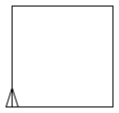
Here you can see a working version of the slideshow rotating through a stack of eight photos as before, with a couple of minor changes. This time we've resized and rotated a couple of the photos and you will see that they display centred in the frame:


At each step the foremost slide undergoes a fading transition to reveal the next photo after which it's moved to the bottom of the stack.
Slideshow photos were generated using Stable Diffusion.
HTML source code
The difference here is that the slideshow is now marked up as an unordered list with each slide contained by a list item.
<ul class="fading-slideshow" style="width: 512px; height: 512px;">
  <li><img src="1.jpg" width="512" height="512" alt=""></li>
  <li><img src="2.jpg" alt=""></li>
  <li><img src="3.jpg" alt=""></li>
  <li><img src="4.jpg" alt=""></li>
  <li><img src="5.jpg" alt=""></li>
  <li><img src="6.jpg" alt=""></li>
  <li><img src="7.jpg" alt=""></li>
  <li><img src="8.jpg" alt=""></li>
</ul>
This means that we don't have to alter the JavaScript if we add or remove links around the images, and can even use other HTML elements and constructs as slides, because HTML5 allows DIV and other elements to be children of list items.
Read on below for an upgraded version of the code where you no longer have to specificy dimensions for the slideshow container.
CSS styles
The CSS has a few changes from the previous example. Each slide is now a list item, and we are setting them to position: absolute, with overflow: hidden, and using Flexbox to center the contents horizontally and vertically:
<style>

  @keyframes fader {
    from { opacity: 1.0; }
    to   { opacity: 0.0; }
  }

  .fading-slideshow {
    position: relative;
    margin: 1em auto;
    padding: 0;
    list-style-type: none;
  }
  .fading-slideshow > li {
    position: absolute;
    left: 0;
    top: 0;
    width: 100%;
    height: 100%;
    overflow: hidden;
    background-color: #fff;
    display: flex;
    justify-content: center;
    align-items: center;
  }

  /* current slide */

  .fading-slideshow > li:first-of-type {
    animation-name: fader;
    animation-delay: 2s;
    animation-duration: 1s;
    z-index: 20;
  }

  /* next slide to display */

  .fading-slideshow > li:nth-of-type(2) {
    z-index: 10;
  }

  /* all other slides */

  .fading-slideshow > li:nth-of-type(n+3) {
    display: none;
  }

</style>
There is also a white background on the slide list items to prevent the lower slides becoming visible if the foremost is smaller in size.
JavaScript source code
In the JavaScript code we've taken advantage of the new querySelector and querySelectorAll methods, which can be combined with NodeList.forEach to great effect. On top of that we've also used the ES6 arrow notation for functions:
<script>

  window.addEventListener("DOMContentLoaded", (e) => {

    // Original JavaScript code by Chirp Internet: www.chirpinternet.eu
    // Please acknowledge use of this code by including this header.

    document.querySelectorAll(".fading-slideshow > li").forEach((current) => {
      current.addEventListener("animationend", (e) => {
        e.target.parentNode.appendChild(e.target);
      });
    });

  });

</script>
That's right, you didn't miss it. That's the entire code. Our slideshow can be powered by a single line of JavaScript, with no variables!
The end result is as before, whenever a slide completes its fader transition, the animationend event handler rotates it to the bottom of the stack.
This version of the code will not work in Internet Explorer or older browsers, but could be rewritten using polyfills if such support was required.
Multiple slideshows on a page
Actually, we don't need to do any more. We're already there. Without any changes, we can create more slideshows on the page by simply adding a new list with the fading-slideshow class.
Here is an example, this time using a combination of text and images:
- to square :length repeat 4 [ fd :length rt 90 ] end square 100
- repeat 3 [ square 100 rt 15 ] lt 45
- make "length 20 arc 360 10 repeat 6 [ repeat 6 [ arc 15 :length rt 60 ] make "length (length + 10) ]
The same single line of JavaScript and some CSS styling is all that you need.
Feel free to use this code in your projects and let us know if you have any comments or questions using the feedback option below.
Automatically calculating width and height
In all of the previous examples we have had to hard code the dimensions of our slideshow into the page. This is because the children (list items) are styled with position: absolute; meaning they take up zero width and height in the page flow.
But what if we could add some code to automatically determine the necessary width and height to contain all the different slides? Actually, we've done that already as you will see if you check the initial (unhydrated) HTML source of this page.
<script>

  window.addEventListener("DOMContentLoaded", (e) => {

    // Original JavaScript code by Chirp Internet: www.chirpinternet.eu
    // Please acknowledge use of this code by including this header.

    document.querySelectorAll(".fading-slideshow").forEach((slideshow) => {

      slideshow.querySelectorAll(":scope > li").forEach((slide) => {

        slide.style.display = "flex";
        let currentHeight = slide.offsetHeight;
        let currentWidth = slide.offsetWidth;
        slide.style.display = "";

        if(!slideshow.style.width || (currentWidth > parseInt(slideshow.style.width))) {
          slideshow.style.width = currentWidth + "px";
        }

        if(!slideshow.style.height || (currentHeight > parseInt(slideshow.style.height))) {
          slideshow.style.height = currentHeight + "px";
        }

        slide.style.width = slide.style.height = "100%";

        slide.addEventListener("animationend", (e) => {
          slideshow.appendChild(slide);
        });

      });

    });

  });

</script>
The new code cycles through all slideshows and slides on the page and briefly makes each slide visible long enough to measure its width (offsetWidth) and height (offsetHeight) before resetting them to their initial states. The dimensions of the largest slide are assigned to the container.
The only change to our CSS is to remove the width/height setting from the list items:
  .fading-slideshow > li {
    position: absolute;
    left: 0;
    top: 0;
/*
    width: 100%;
    height: 100%;
*/
    overflow: hidden;
    background: #fff;
    display: flex;
    justify-content: center;
    align-items: center;
  }
And in the HTML we must of course remove the width and height styles:
<ul class="fading-slideshow" style=">width: 382px; height: 292px;">
  ...
</ul>
Now, as the slideshows are being initialised on page load, the width and height of the container will be adjusted to fit around the dimensions of the largest slide. And you can add padding as you want to ensure there is a margin around each slide.
The code can still work if you do not specify width and heights for any of the images, but only if they have already been loaded and cached. For some examples we have specified a width and height for the first photo.
Showing the slides only once
This seems to be a popular request - having a slideshow that only runs once and then ends or takes you to another page.
The following code will cause the slideshow to halt on the last slide and could be easily adapted to halter after two or three rotations:<script>
window.addEventListener("DOMContentLoaded", (e) => {
// Original JavaScript code by Chirp Internet: www.chirpinternet.eu
// Please acknowledge use of this code by including this header.
document.querySelectorAll(".fading-slideshow").forEach((slideshow) => {
let slides = slideshow.querySelectorAll(":scope > li");
slides.forEach((slide, idx) => {
slide.style.display = "flex";
let currentHeight = slide.offsetHeight;
let currentWidth = slide.offsetWidth;
slide.style.display = "";
if(!slideshow.style.width || (currentWidth > parseInt(slideshow.style.width))) {
slideshow.style.width = currentWidth + "px";
}
if(!slideshow.style.height || (currentHeight > parseInt(slideshow.style.height))) {
slideshow.style.height = currentHeight + "px";
}
slide.style.width = slide.style.height = "100%";
slide.addEventListener("animationend", (e) => {
if(idx + 2 == slides.length) {
slides[idx+1].style.animationName = "none";
/* slideshow ends here after all slides have been shown once */
}
if(idx + 1 < slides.length) {
slideshow.appendChild(slide);
}
});
});
});
});
</script>
The last slideshow animation will have completed at the point indicated in the code. Here you could insert a redirect or other action to take.
To allow for multiple rotations you would need to have an extra counter variable as 'idx' which comes from forEach will zero itself each time. And use (n * slides.length).
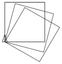
Sliding Carousel
With some small alterations to the CSS we can have a completely different layout and animation sequence.
Here the first slide is rotating and fading while the subsequent slides shift across to fill the gap:
You don't have to have a white gap appearing on the right with every transition. The carousel photos can be set to extend out of sight with a new one sliding in at each step.
The catch here is to check the e.animationName value to make sure only the fade transition triggers moving the slide to the back of the line.
References
Related Articles - Transforms and Transitions
- CSS Transition Timing Functions
- CSS Bouncing Ball Animation
- CSS Animation Using CSS Transforms
- CSS 3D Transforms and Animations
- CSS Animated Background Gradients
- CSS Upgraded fading slideshow
- CSS An actual 3D bar chart
- CSS Photo Rotator with 3D Effects
- CSS Infinite Animated Photo Wheel
- JavaScript CSS Animated Fireworks
- JavaScript Animating objects over a curved path
- CSS Fading slideshow with a touch of JavaScript
- JavaScript Controlling CSS Animations
Julian 15 June, 2026
This is a great replacement for the old cycle.js scripts. Might the CSS grid-pile pattern offer an alternative to using position: relative and position: absolute, avoiding the need to calculate the container height? For example, use display:grid; and grid-template-areas: "slideshow"; on the ul and grid-area: slideshow; on the li-items.
Yes, there are certainly more modern CSS approaches which would work better than the original approach
Stephen 9 December, 2024
Is there a version of this with dots?
John 17 August, 2022
Would anyone have any input on letting this loop through a set amount of times and then stopping it. What I am essentially trying to accomplish is to have the user see the slideshow and only the slideshow once, then load the webpage content after looping through. Thanks in advance for any input.
Matthias 28 December, 2021
I was searching the web for a simple fading slideshow. This is by far the simplest and smartest solution that I found. Thanks!