
CSS: Animated Background Gradients
The @property CSS at-rule is an extension of CSS variables that allows them to be more specifically typed and, it seems, enables the values to be animated to create interesting effects using pure CSS and no JavaScript.
Repeating linear gradient with animated angle
Let's start with a quick example of a background linear gradient in which the <angle> value is being animated using a @keyframes block and the new @property at-rule syntax.
In supporting browsers you should see a gradient that rotates slowly around 180 degrees and then back. Hover your mouse over the container to see an expanded version.
@property --a {
  syntax: "<angle>";
  inherits: false;
  initial-value: 135deg;
}

@keyframes bgrotate {
  from {
    --a: 135deg;
  }
  to {
    --a: 315deg;
  }
}

#gradient {
  background-image: repeating-linear-gradient(var(--a), #cc5500, yellow 10vw);
  animation-name: bgrotate;
  animation-direction: alternate;
  animation-iteration-count: infinite;
  animation-duration: 30s;
}
In the CSS markup you can see where the magic is happening. For the background-image property there is a reference to the --a variable, actually a @property at-rule, which our bgrotate @keyframes animation is causing to animate between two values.
Animating multiple properties
Building from the previous example we are now going to add and animate a second parameter representing the width of the repeating gradient:
As the background rotates the lines compress and expand accordion-style. The animation has also been sped up a bit.
@property --b {
  syntax: "<length>";
  inherits: false;
  initial-value: 10vw;
}

@keyframes bgrotate {
  from {
    --a: 135deg;
    --b: 10vw;
  }
  to {
    --a: 315deg;
    --b: 2vw;
  }
}

#gradient {
  background-image: repeating-linear-gradient(var(--a), #cc5500, yellow var(--b));
  animation-name: bgrotate;
  animation-direction: alternate;
  animation-iteration-count: infinite;
  animation-duration: 10s;
}
From here it's a simple matter to insert more variables - for colours, timing and so forth. You can see some of this below.
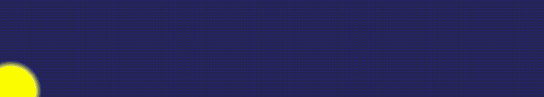
Animating radial gradients
Animating a radial gradient is a bit trickier. The simplest approach is to change the position of the gradient within its container which is demonstrated here. At the same time we're changing the colours.
In supporting browsers you should see a yellow sun rise and move in an arc across the container as the background lightens and darkens:
For this example we've defined three @property variables which are referenced in the gradient setting, and one @keyframes to animate their values:
@property --c {
  syntax: "<percentage>";
  inherits: false;
  initial-value: 0%;
}

@property --d {
  syntax: "<percentage>";
  inherits: false;
  initial-value: 0%;
}

@property --e {
  syntax: "<color>";
  inherits: false;
  initial-value: midnightblue;
}

@keyframes movecenter {
  from {
    --c: 0%;
    --d: 100%;
    --e: midnightblue;
  }
  50% {
    --d: 20%;
    --e: lightblue;
  }
  to {
    --c: 100%;
    --d: 100%;
  }
}

#gradient {
  background-image: radial-gradient(circle farthest-corner at var(--c) var(--d), yellow 2em, var(--e) 2.5em);
  animation-name: movecenter;
  animation-iteration-count: infinite;
  animation-timing-function: ease-in-out;
  animation-duration: 10s;
}
For non-supporting browsers, here's a taste of what you're missing (the reality in the browser is a lot faster and smoother):
Animated button effects
This seems to be the trend now - having special effects on buttons where the background shifts as you point or click. In these examples a simple 'flare' effect is moved across the button:
The trick seems to be that you need to specifically define a tranisition for each variable as just transition: 0.5s doesn't produce an animation. Here we have set the transition for --f to 0.5s.
@property --f {
  syntax: "<percentage>";
  inherits: false;
  initial-value: 10%;
}

#gradient_buttons > div {
  background-image: radial-gradient(circle at var(--f) var(--f), rgba(255,255,255,0.75), rgba(255,255,255,0) 2em);
  transition: --f 0.5s;
}
#gradient_buttons > div:hover {
  --f: 90%;
}
There seem to be some limitations when it comes to animating the distance values in radial gradients. In this example we are able to transition the origin of the gradient as before, but the expansion of the circles takes place immediately with no animation:
Perhaps this will be fixed in future browsers?
Browser support
At time of writing the above examples are working in Safari, Chrome and Opera web browsers, but not in Firefox. They may even work in the latest version of Edge!
References
- Stack Overflow: How to Animate Gradients using CSS
- Stack Overflow: How to animate a radial-gradient using CSS?
Related Articles - Transforms and Transitions
- CSS Transition Timing Functions
- CSS Bouncing Ball Animation
- CSS Animation Using CSS Transforms
- CSS Animated Background Gradients
- CSS 3D Transforms and Animations
- CSS Upgraded fading slideshow
- CSS Photo Rotator with 3D Effects
- CSS Infinite Animated Photo Wheel
- CSS An actual 3D bar chart
- JavaScript Animating objects over a curved path
- JavaScript CSS Animated Fireworks
- CSS Fading slideshow with a touch of JavaScript
- JavaScript Controlling CSS Animations